Nice work Dennis!
If i need to change some things, i would horizontal align (to center) the crayon left of the fill-in field.
And i'm not sure u need the drop shadow around the boxes.
But that really are details, keep it coming! :)
@Elliot@Bram Zwinnen [ZWAM] Good catch with that pencil. I aligned it like that because if you type a lot of sentences into that input field, it grows. If you align the pencil to the center of that input field it moves together with the inputfield when it grows.
Now it stays on top...
Very interesting. It looks great, but its usability isn't instantly clear to me.
Is the #3 a cta on the big view?
The typeface/font on the big view should be reviewed for readability.
Is this for touch devices? Then the 'Sign In' is too close to the form field as a touch target.
'Your comments:' 's placement is kinda random. Maybe there's another anchor to align it with? More than likely, you would choose the identity ('Anonymous')?
But yeah I am nit-picking :P Love the visual framework though.
@Abhimanyu Chirimar It's a widget for commenting on specific parts of a website. Like a live report of a football match for example. People can click the chat bubble and then it shows the big view. The badge with '3' is the number of comments. In this case it should be 2 instead of 3.
The 'Your comments:' can be aligned in the middle of the box.
11 Responses
Pro
Dennis Covent
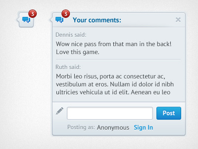
A little chat widget. Feedback would be appreciated!
about 1 year ago
Pro
Elliot
The pencil should be aligned with the text area. Other than that looking good. :)
about 1 year ago
Pro
Bram Zwinnen [ZWAM]
Nice work Dennis!
If i need to change some things, i would horizontal align (to center) the crayon left of the fill-in field.
And i'm not sure u need the drop shadow around the boxes.
But that really are details, keep it coming! :)
about 1 year ago
Pro
Naoshad
sick!
about 1 year ago
Pro
Dennis Covent
@Elliot @Bram Zwinnen [ZWAM] Good catch with that pencil. I aligned it like that because if you type a lot of sentences into that input field, it grows. If you align the pencil to the center of that input field it moves together with the inputfield when it grows.
Now it stays on top...
about 1 year ago
Pro
Bobby Giangeruso
Love this!
about 1 year ago
Pro
Abhimanyu Chirimar
Very interesting. It looks great, but its usability isn't instantly clear to me.
Is the #3 a cta on the big view?
The typeface/font on the big view should be reviewed for readability.
Is this for touch devices? Then the 'Sign In' is too close to the form field as a touch target.
'Your comments:' 's placement is kinda random. Maybe there's another anchor to align it with? More than likely, you would choose the identity ('Anonymous')?
But yeah I am nit-picking :P Love the visual framework though.
about 1 year ago
Pro
Dennis Covent
@Abhimanyu Chirimar It's a widget for commenting on specific parts of a website. Like a live report of a football match for example. People can click the chat bubble and then it shows the big view. The badge with '3' is the number of comments. In this case it should be 2 instead of 3.
The 'Your comments:' can be aligned in the middle of the box.
It is for web btw :)
Thanks for your feedback!
about 1 year ago
Pro
Abhimanyu Chirimar
@Dennis Covent Yeah I thought so about the #sign. Great work man :)
ps - I love your city, try to visit each year. Think Brussels is overrated compared to Antwerp :P
about 1 year ago
Pro
Dennis Covent
@Abhimanyu Chirimar Haha yeah, Antwerp is such a lovely city!
about 1 year ago
Rebound
Little chat widget v2
by Dennis Covent
Thanks for the previous feedback. Together with the client's feedback I reviewed this little widget.
There are 2 version of the icons: normal & mini.
Let me know your thoughts!
(You can find the emoticons here by Prekesh Chavda)
about 1 year ago