Theater National of Toulouse

DESIGN GUIDELINES
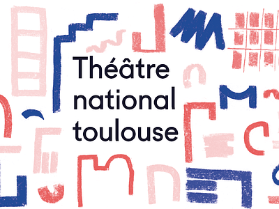
Typography : we had to select two typography: The Rockwell with wheelbase that refers to buildings bricks and the fugue because of its recent aspect. These two typography are a mix of the old and modern one.
Color : We chose three colours: two tint of pink referring to the city of Toulouse, the blue for the typical theater piece named blue.
Logo : After many drafts and sketchs with chalk, one is catching our attention with some very fascinating shapes.
CONCEPTION
After analyzing our logo process, we decided to focus mainly on the architecture to design our logo, mixing between material forge and with a contrast between the old and modern one, with a final addition of colors and shapes.


