Really like all the little details in your work Liam.
Only thing I would suggest is maybe the 2010 is not necessarily needed (could have full date on title tag?).
Might be cool to slightly offset the part of the stamp that doesn't fall on the card, so it looks like the card is fractionally above the background (as indicated by the shadow).
I am wondering the HTML and CSS that will be needed to implement this. Will definitely look under the hood when I get a chance. (Esp. because even the underline is a pattern!). Would you really make these many requests or a Sprite? Hoping there is some CSS magic I am honestly not aware of!
Love the subtleness of the texture by the way and that purple icon is the icing on the cake.
@Pete - Awesome suggestion and it might just work. I'll give it a go for sure.
@Tuhin - I'm not doing the CSS but my developer hasn't had any problems with it yet. I'm not sure how he's going to tackle it yet but I'm sure you'll get a good look at it when it's finished.
15 Responses
Pro
Liam McKay
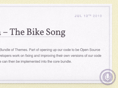
Nothing complicated, a very simple layout with some careful and subtle textures added. Oh and a little category stamp.
View at 50% or a quick video to see some context.
over 2 years ago
Pro
Andy Shaw
Really like all the little details in your work Liam.
Only thing I would suggest is maybe the 2010 is not necessarily needed (could have full date on title tag?).
over 2 years ago
Pro
Matt Dunn
Just lovely.
over 2 years ago
Pro
Pete Lacey
Awesomely subtle texture work.
Might be cool to slightly offset the part of the stamp that doesn't fall on the card, so it looks like the card is fractionally above the background (as indicated by the shadow).
But on second thoughts, that might look balls.
:D
over 2 years ago
Pro
Tuhin Kumar
I am wondering the HTML and CSS that will be needed to implement this. Will definitely look under the hood when I get a chance. (Esp. because even the underline is a pattern!). Would you really make these many requests or a Sprite? Hoping there is some CSS magic I am honestly not aware of!
Love the subtleness of the texture by the way and that purple icon is the icing on the cake.
over 2 years ago
Pro
Liam McKay
@Andy - Cheers, I just sort of liked the placement of the date, but I could have a play with it as you've suggested and see how it looks.
@Matt - Thank-you sir!
@Pete - Awesome suggestion and it might just work. I'll give it a go for sure.
@Tuhin - I'm not doing the CSS but my developer hasn't had any problems with it yet. I'm not sure how he's going to tackle it yet but I'm sure you'll get a good look at it when it's finished.
over 2 years ago
Looking great, Liam. The textures add a lot without being too much.
over 2 years ago
Pro
Matthew Skiles
You never cease to amaze me Liam :)
over 2 years ago
Pro
Patrick Algrim
Reminds me of a check. Like it though.
over 2 years ago
Pro
Forefathers™
This is awesome! My only suggestion would be to make the date the same color as paragraph type?
over 2 years ago
textures are perfectly subtle
over 2 years ago
Pro
Glenn Van Bogaert
Subtle textures, soft colors and nice typography. Really love it.
over 2 years ago
Pro
Jake Przespo
Looks great Liam! It makes me want to go buy some stationary.
over 2 years ago
Rebound
Purple Play & Pause
by Liam McKay
Trust me, it works much better when you can see the full page. "Soft" was the approach, with not only the buttons, but the surrounding areas too.
View at 50% or a quick video to see some context.
over 2 years ago
Pro
Denis Korotkov
beautiful
about 1 month ago