Pricing Page

18 Responses

  1. Pro Claudiu Cioba Claudiu Cioba

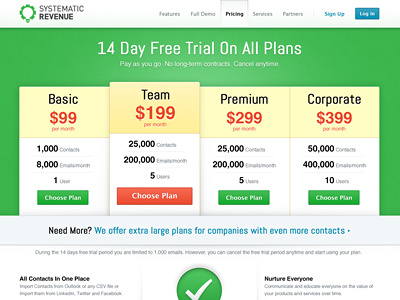
    I have taken your feedback in consideration and redesigned the pricing page. Please feel free to compare the two variations, feedback is always appreciated.

    Follow me on twitter to know when we launch Systematic Revenue.

    about 1 year ago

  2. Pro Joshua Sortino Joshua Sortino

    This is much nicer! The colors really blend nicely. I'm also a fan of the large call to action for the team plan.

    likes

    about 1 year ago

  3. Pro Adam Amran Adam Amran

    I'm loving this, the colors are especially very nice ;)

    likes

    about 1 year ago

  4. Pro Ragnar Võrel Ragnar Võrel

    This is looking really wonderful. Great colors.

    likes

    about 1 year ago

  5. Pro Daniel Alb Daniel Alb

    really, really nice!

    likes

    about 1 year ago

  6. Pro Lukas Bugla Lukas Bugla

    This one looks much more friendly. Well done!

    likes

    about 1 year ago

  7. Pro Isaac Bordons Isaac Bordons

    Wow, this version is better for sure. Less hard and colors are more harmonic.

    likes

    about 1 year ago

  8. Pro Claudiu Cioba Claudiu Cioba

    Thank you so much for the nice words, it's very motivating. I have just added an actual size preview so that you can enjoy it even more :)

    about 1 year ago

  9. Pro Prakash Ghodke Prakash Ghodke

    Great colors!!

    likes

    about 1 year ago

  10. Pro Tanveer Junayed  Tanveer Junayed 

    Amazing colors and layout. Everything is matching with everything!

    likes

    about 1 year ago

  11. Pro Claudiu Cioba Claudiu Cioba

    Thanks, I truly appreciate it!

    about 1 year ago

  12. Pro David Kovalev David Kovalev

    very clean, nice job :)

    likes

    about 1 year ago

  13. Pro David Simpson David Simpson

    Love this. Great job!

    likes

    about 1 year ago

  14. Pro Claudiu Cioba Claudiu Cioba

    Thank you, thank you very much :))

    about 1 year ago

  15. Vasily Myazin Vasily Myazin

    You are killing it, Claudiu! Clarity and elegance in one bright package.

    likes

    about 1 year ago

  16. Pro Jonas Lempa Jonas Lempa

    because of the red-colored button, i want to push intuitively one of the green buttons - even if this box is bigger then the others. Seriously, never ever use red for call-to-action, we tested it on long-term with platforms with a huge number of visitors. Best performing color was blue, afterwards green ... but red is really the worst one. And if you dont believe me - try it with a A/B test after the website went online :) ... just want to give you a good advice!

    likes

    about 1 year ago

  17. Pro Claudiu Cioba Claudiu Cioba

    @Jonas Lempa Thank you for the advice, this page is a work in progress and the reason why I used red was to capture attention. You also need to consider that the background color is green and if green/blue buttons are used with a green background it would be too monochromatic.

    Thanks for your input anyway, that's what dribbble is for after all. As I said, this is a work in progress so there will be changes.

    likes

    about 1 year ago

  18. I had another try at the pricing page and it came out so much better then the previous version. It's funny how you can see the evolution of this page on my profile page.

    Don't forget to checkout the large preview and follow me :P

    about 1 year ago

keyboard shortcuts: previous shot next shot L or F like