Find designers
Designer search
Quickly find your next designer
Post a job
The #1 job board for design talent
Inspiration
Courses
UX Diploma
Learn UX design from scratch in 6 months
UI Certificate
12-week UI skill building for designers
Live interactive workshops
with design professionals
Jobs
Go Pro
Log in
Dribbble: the community for graphic design
Log in
Sign up
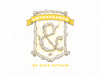
Amperbranch Logo
Ryan Putnam
Follow
Following
Like
#FDFCFB
#FFD736
#C4BBA6
#E8DAA8
#B3A68F
#A19171
#CDB35E
Download color palette
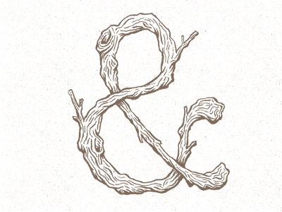
Making a logo for an Amperbranch site I'm putting together to sell some Amperbrach goodies.
Rebound of
Amperbranch
By
Ryan Putnam
branch
brand
branding
crest
hand drawn
logo
rustic
seal
sketch
wood
View all tags
Posted on Mar 20, 2012
9,846
27
311
27
View feedback
Ryan Putnam
Welcome to my design portfolio on Dribbble
More by Ryan Putnam
View profile
Previous
Next
Loading…