Thorncrown Chapel Logo

I wanted to do another logo practice exercise today to keep flexing those muscles. Today I made a logo for Thorncrown Chapel, a beautiful chapel and piece of architecture located in the forest and mountains of Eureka Springs, Arkansas. The chapel itself is a marvel as it is mostly glass, other than the steel skeleton, so when you're inside the chapel, it feels like you're still outside in nature.
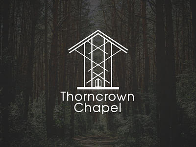
For the logo, I did a simple line art representation of the steel skeleton of the structure. The logo looks great on a solid background, but I feel it better represents the actual chapel when it's over a photo of a forest, allowing the view nature to go right through it.
I debated whether to do the ends of the lines as rounded or with hard right angles, and although I think rounded angles 'usually' give a cleaner look, I didn't feel that it represented the actual chapel, with its hard edges from the steel and the glass, so in this case I ended with hard angles for the lines.
Any thoughts or feedback on how I could improve it?
*Photo from Kirill Nechmonya @ Unsplash:
https://unsplash.com/photos/WH4e0NVslsc


