iOS Retina for New iPad

Retina

1 Attachment

24 Responses

  1. Eric Hoffman Eric Hoffman

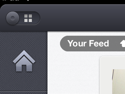
    Right smack in the middle of building this app out the New iPad came out. So here I am converting everything for the @2x assets.
    The attachment does not do justice as to how clear this devices display is!

    Simply beautiful!

    likes

    over 1 year ago

  2. Brian Plemons Brian Plemons

    I'm viewing this on a retina displ... OHHHH MYYY GOD! ;)

    likes

    over 1 year ago

  3. Cory Staudacher Cory Staudacher

    Gotta love @Kyle Steed

    likes

    over 1 year ago

  4. Jarno Fabritius Jarno Fabritius

    Ok now I'll let my wife know I need yet another apple product

    likes

    over 1 year ago

  5. Garrett Gee Garrett Gee

    that background texture on the left is pretty insane

    likes

    over 1 year ago

  6. Tyler Reckart Tyler Reckart

    Love it.

    likes

    over 1 year ago

  7. Ari Ari

    Looking good, sir.

    likes

    over 1 year ago

  8.  Wouter de Bres Wouter de Bres

    Mr. Hoffman, that looks ace!

    likes

    over 1 year ago

  9. Josh Austin Josh Austin

    Legit.

    likes

    over 1 year ago

  10. Ray Sison Ray Sison

    my god that screen scares me ha.

    likes

    over 1 year ago

  11. Nathan Walker Nathan Walker

    The retina is cool but mildly irritating for iOS designers such as ourselves. Looks awesome

    likes

    over 1 year ago

  12. Tanveer Junayed  Tanveer Junayed 

    Colors and patterns are great. Love the details :)

    likes

    over 1 year ago

  13. Jonathan Ogden Jonathan Ogden

    Lovely! So is the retina display on the iPad just double the pixels? That makes upscaling graphics a bit easier.

    likes

    over 1 year ago

  14. Jack Bingham Jack Bingham

    You changed the refresh icon! Yay! :)

    over 1 year ago

  15. Daniel Price Daniel Price

    So nice. I'm going to need an iPad just for this App... but can I ask, is there any particular reason for the rise in popularity of rounded corners on iOS apps, or is it simply cosmetic?

    Either way, I like it.

    likes

    over 1 year ago

  16. Viszt Péter Viszt Péter

    Really nice. The house is not centered correctly, 1px to the left i think:)

    likes

    over 1 year ago

  17. Ivan Tolmachev Ivan Tolmachev

    @Eric Hoffman Have you come up with any performance issues when designing? I was working on converting for the @2x assets last week, my poor old Macbook barely made it :)

    likes

    over 1 year ago

  18. Matthew Sanders Matthew Sanders

    Love seeing this convention take place.

    likes

    over 1 year ago

  19. Eric Hoffman Eric Hoffman

    WHOA! Everyone thanks for all your great support and feedback!

    @Ivan Tolmachev no I am not experiencing any issues. Thats a bummer man.

    @Daniel Price yeah just a treatment that is purely cosmetic.

    @Jonathan Ogden yep. For size you just double. You gotta make sure though that your layer effects are doubled too.

    likes

    over 1 year ago

  20. Andrey S. Rodrigues ☝ Andrey S. Rodrigues ☝

    great job man, I can not wait to be released, but the home icon seems a little off

    over 1 year ago

  21. Daniel Price Daniel Price

    Is the DPI any different?

    over 1 year ago

  22. Eric Hoffman Eric Hoffman

    @Daniel Price no DPI change.

    over 1 year ago

  23. Trent McBride Trent McBride

    @Eric, your work is just divine! I fell in love with the Zendesk interface as soon as I saw it. Loving your work a lot! Keep it up so that I can be more inspired! :)

    about 1 year ago

  24. Julia Khusainova Julia Khusainova

    @Eric Hoffman, this is incredible! Love every single detail and can't stop looking at it

    about 1 year ago

keyboard shortcuts: previous shot next shot L or F like