Find designers
Designer search
Quickly find your next designer
Post a job
The #1 job board for design talent
Inspiration
Courses
UX Diploma
Learn UX design from scratch in 6 months
UI Certificate
12-week UI skill building for designers
Live interactive workshops
with design professionals
Jobs
Go Pro
Log in
Dribbble: the community for graphic design
Log in
Sign up
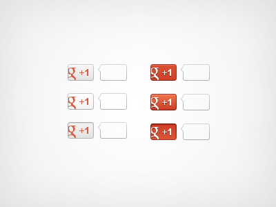
+1 button version 2
Morgan Allan Knutson
Available for work
Follow
Following
Like
Get in touch
#F4F4F4
#B2B2B2
#D64D30
#D76549
#983022
#E6AAA0
#DC8674
#6F1F12
Download color palette
We just launched this new button.
1
button
View all tags
Posted on Mar 16, 2012
13,947
19
410
41
View feedback
Morgan Allan Knutson
Get in touch
More by Morgan Allan Knutson
View profile
Previous
Next
Loading…
Loading…
Loading…