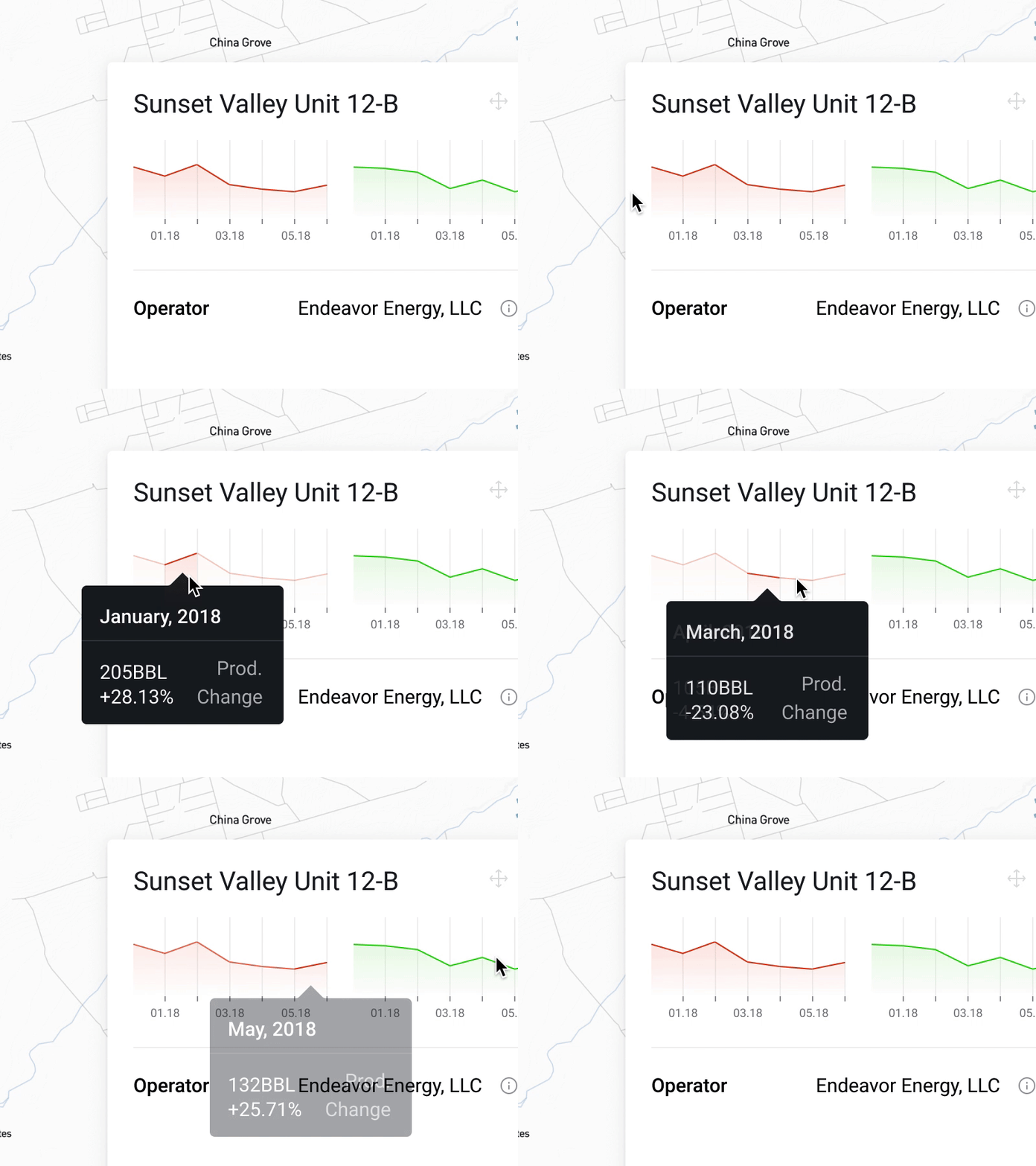
Interactive charts
This is a chart representing production data on a well. I wanted to show the general feel of production (how is it changing over the past six months) without adding a lot of visual clutter.
These little charts place emphasis on the shape of the data, while still allowing exploration into sections of the information if a user's interested. The colors have specific industry meaning, and the units (BBL) clarify the type of data that this represents.
I also included some other formats for these charts, as well as a "data missing" rev in the attachment. Feedback welcome, as always. 😁
If you have any mapping experience by the way, I really want to learn from you. Email me at alex@alexprice.co.
View all tags
Posted on
Jun 25, 2018
More by Alex Price View profile
Like


