Snapshot

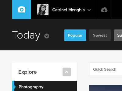
Snapshot is a Photography Community Concept UI Design. My main focus was to create a very good UX while keeping it minimal enough to optimize page speed, and maintaining an attractive and modern visual. Less is more approach.
Full View @ dA: http://edumicro.deviantart.com/art/Snapshot-290539640


