Show them the incredibly positive reaction on here and maybe they'll change their mind! It would be a heck of a lot of work to redraw the entire thing but if you change it somewhat you could tailor it to a more Mexican look: add some blackletter cues, and the filigree doesn't say "Mexican" to me. Some different type of ornamentation. Looks really great, though, in my opinion - try to convince them a little more!
39 Responses (page 1 of 2)
Pro
Drew Melton
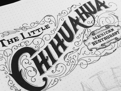
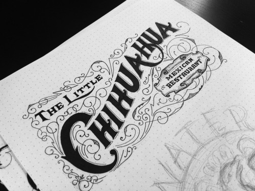
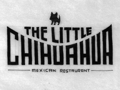
Took the Little Chihuahua concept in a completely different direction after getting client feedback.
See the full size image HERE
about 1 year ago
Pro
Rhodi Iliadou
So amazing! Love that line work!
about 1 year ago
Pro
Michael Spitz
Classy stuff Drew. Loving that 'H/A' ligature.
about 1 year ago
Loving the AH ligature on Chihuahua
about 1 year ago
Pro
Neil Tasker
They didn't like this???
about 1 year ago
Wow, man. Just wow.
I've got to say, I would love to see your work process for one of these drawings. (honestly I would probably watch several of them)
about 1 year ago
Pro
Mike Bruner
really...really nice!
about 1 year ago
Pro
Nate Eaton
shame that they didn't love it. I'd eat there with a sign like this.
about 1 year ago
I like both concepts, but obviously this is more 'your style' and I love your elegant lettering!
about 1 year ago
Great Drew!
about 1 year ago
I'm with @Nate, even if it said "serving the finest chihuahua meat" I would try it simply because of the sign.
about 1 year ago
You are just ridiculously talented. Keep it up!
about 1 year ago
Pro
Inka Mathew
It's beautiful. But I can understand the client. This one doesn't really give a Mexican vibe. More towards Victorian.
about 1 year ago
Pro
Greg Eckler
Agreed that AH ligature is amazing!
about 1 year ago
Pro
kirk visola
Well, some people are just stupid. This is awesome.
about 1 year ago
Pro
Nick Slater
WHAT! Clients are crazy! But still this is awesome!
about 1 year ago
Pro
Nikita Prokhorov
Great work....absolutely great.
about 1 year ago
I'd wear that as a tee, seriously. Love the type, love Mexican restaurants ;)
about 1 year ago
Pro
Joseph Alessio
Show them the incredibly positive reaction on here and maybe they'll change their mind! It would be a heck of a lot of work to redraw the entire thing but if you change it somewhat you could tailor it to a more Mexican look: add some blackletter cues, and the filigree doesn't say "Mexican" to me. Some different type of ornamentation. Looks really great, though, in my opinion - try to convince them a little more!
about 1 year ago
Pro
Ged Palmer
Real nice work Mr Melton!
about 1 year ago
Pro
Fabio Benedetti
@Drew Melton great typography fella ++
about 1 year ago
Best Burrito in SF. Now with a logo to match.
about 1 year ago
Pro
Derrick Castle
HOLY SHIT! That is awesome! How could they not dig that??
about 1 year ago
Lovely work i love the detailed pattern work. What make note book is that?
about 1 year ago
Pro
Sam Stratton
come on now, that's incredible!
about 1 year ago