This is incredible work... the detail in the latches, all of the subtle textures, and the overall color scheme are all working together so well. (the blue toolbar in the full shot is really nice too)
Two suggestions: I think that the text would benefit from a slight drop shadow to make it stand out from the background a little more. And there is an orange-ish highlight around the curve of the book spine looks jagged, maybe that could be bumped up in size or removed all together?
Again, those are just two small suggestions to an already beautiful UI :)
stunningly well designed as per usual. However personally I prefer the simple, chrome-less designs in Photos compared to the new iPhoto and this similar design.
But its just my opinion, and there's no question its a beautiful piece
35 Responses (page 1 of 2)
Pro
Cuberto
Hey!
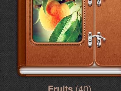
See the part of interface for The New iPad with closed album.
The next step is the open album.
Don't forget to check the attachment.
about 1 year ago
Oh yeh! Awesomeness!!
about 1 year ago
Pro
Lukas Bugla
Wow!
about 1 year ago
Pro
Jarno Fabritius
Looks so good!
about 1 year ago
Pro
matt ⚒
dude...
about 1 year ago
Pro
Christophe Tauziet
Looks amazing :)
about 1 year ago
wow, really great
about 1 year ago
I really like it! :) Just the lock is looking a little bit too flat for me :)
about 1 year ago
loved the lock details, amazing work
about 1 year ago
Pro
Juan Arreguin
@CubertoI thought your mockup had a bit too much detail for a drawing.
But holy smokes, I swallow my own words, I see why you did so much detail. Looks great!
about 1 year ago
Pro
Mark Bauer
This is incredible work... the detail in the latches, all of the subtle textures, and the overall color scheme are all working together so well. (the blue toolbar in the full shot is really nice too)
Two suggestions: I think that the text would benefit from a slight drop shadow to make it stand out from the background a little more. And there is an orange-ish highlight around the curve of the book spine looks jagged, maybe that could be bumped up in size or removed all together?
Again, those are just two small suggestions to an already beautiful UI :)
about 1 year ago
Pro
Jean-Marc Denis
Looks gorgeous!
about 1 year ago
Pro
Yoga Perdana
O_o love it!
about 1 year ago
love the leather texture and stitches. so cool!
about 1 year ago
Pro
Meng To
Absolutely gorgeous.
about 1 year ago
Pro
Jan Vu Nam
Oh my god. Even in retina big ass resolution it is extremely gorgeous. Damn it, well done!
about 1 year ago
Pro
Prekesh Chavda
Isn't this too much?
about 1 year ago
Pro
Eddie Lobanovskiy
awesomenessss! :)
about 1 year ago
Its gorgeous. iPad retina is awesome !
about 1 year ago
Pro
Haziq Mir
Suicide in 3… 2… 1
about 1 year ago
Pro
Andrea Cau
NO WORDS.
about 1 year ago
Woooow!
about 1 year ago
Great details wow! True, we need to start designing in ultra high-res now for the retina screen on the iPad. Gonna need bigger screens!
about 1 year ago
stunningly well designed as per usual. However personally I prefer the simple, chrome-less designs in Photos compared to the new iPhoto and this similar design.
But its just my opinion, and there's no question its a beautiful piece
about 1 year ago
Pro
Bobby Giangeruso
Very sharp, love it :)
about 1 year ago