Find designers
Designer search
Quickly find your next designer
Post a job
The #1 job board for design talent
Inspiration
Courses
UX Diploma
Learn UX design from scratch in 6 months
UI Certificate
12-week UI skill building for designers
Live interactive workshops
with design professionals
Jobs
Go Pro
Log in
Dribbble: the community for graphic design
Log in
Sign up
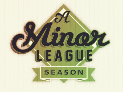
A Minor League Season
Bethany Heck
Follow
Following
Like
#F5F4E2
#9CA457
#2C292F
#D9CDA9
#6E7048
#4F4B37
#C2AF73
Download color palette
Logo for a very exciting project that is launching next week!
baseball
logo
script
sports
View all tags
Posted on Mar 14, 2012
2,116
4
46
7
View feedback
Bethany Heck
More by Bethany Heck
View profile
Previous
Next
Loading…