Osfoora Icon

Osfoora

3 Attachments

24 Responses

  1. Pro Jean-Marc Denis Jean-Marc Denis

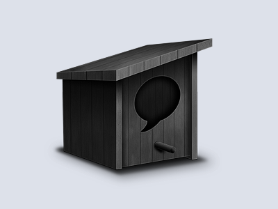
    I have been asked to re-design the actual Osfoora icon for the Mac application. That what I have made but we are not sure about the perspective.

    What do you think guys?

    PS: Huge thanks to Emanuel Sá for his help

    about 1 year ago

  2. Pro Kubilay Sapayer Kubilay Sapayer

    nice but how does it look in the dock ?

    likes

    about 1 year ago

  3. Ari Ari

    I'd add a bit more color to it.

    likes

    about 1 year ago

  4. Eric Merced Eric Merced

    I agree with @Kubilay Sapayer. Knowing how it works on the dock is key. I am not too sure about the perspective though, still, this is a HUGE improvement from the original icon. Bravo!

    about 1 year ago

  5. Pro Jean-Marc Denis Jean-Marc Denis

    @Eric Merced @Kubilay Sapayer That's how it looks in the dock but it needs some work.

    about 1 year ago

  6. Pro Sean Farrell Sean Farrell

    Looks like no bird has lived there for years, you might as well draw a cobweb in the middle of that speech bubble.

    Add some color for sure. The perspective looks good.

    likes

    about 1 year ago

  7. Eric Merced Eric Merced

    @Jean-Marc Denis I missed that. But now that I see it, I'd say a slight bigger as it's getting outsized by the other icons and maybe a different color for the wood? Maybe even a natural wood color? Although that all depends on what they want. I know the original icon has a gray color and goes in tone with the app's UI but, a livelier color would be nice if they considered it.

    about 1 year ago

  8. Pro Julien Rousseau Julien Rousseau

    It looks good however keep in mind that some people use the 2D dock (way darker than the 3D one). my 2D dock

    about 1 year ago

  9. Pro Jean-Marc Denis Jean-Marc Denis

    about 1 year ago

  10. Seb Jachec Seb Jachec

    I like the perspective and the wood, but when put it the dock, it looks very dark and gloomy. Try adding some colour, or just lightening it up a bit!

    I like the idea though :)

    about 1 year ago

  11. Pro Julien Rousseau Julien Rousseau

    @Jean-Marc Denis Not bad indeed.

    about 1 year ago

  12. Pro Olivier Garcia Olivier Garcia

    Perfect originality, but, maybe these lines is not coherent with the top line http://api.cld.me/1a1W0K1a003C1P2F0e3a/line.png

    about 1 year ago

  13. Pro Jean-Marc Denis Jean-Marc Denis

    @Olivier Garcia True indeed! Will fix.

    likes

    about 1 year ago

  14. Jono Jono

    I really like the angle. It's different, but so what? For me it works.

    My only (small) concern is that there's no contrasting colours so looks quite dark. But then again when I look at the screenshots of it in the dock I don't mind that so much :)

    Also, I like the ends of the planks at the front of the house. Maybe when you fix it you could make the planks run this way, seeing as not a lot of details are too obvious with the icon being quite dark.

    Can't wait for them to use it in the app.

    about 1 year ago

  15. Pro Maxim Melnikov Maxim Melnikov

    The perspective looks good, but it doesn't match the “Apple Human Interface Guide” requirements. Read about it here: http://cl.ly/F3by

    about 1 year ago

  16. Toby Seers Toby Seers

    It probably wouldnt make any difference for actual dock use, butif the cut out section is meant to show the 'back' of the bird house then its slightly off. To me it just looks like there's another piece of wood there. If you want to look like the back it would need to show to far right corner. Just my 2 cents

    about 1 year ago

  17. Pro Christopher Downer Christopher Downer

    I like this. Just a few things though. I find it looks a little too small in the dock, may just be me? The wood paneling on the roof doesn't match. It's showing at the front but there's no lines joined at the top. The lines going across the top nearly match with those on the rim of the left side.
    I don't think you should be able to see any of the panels on the inside of the house. It seems a bit too weird. And lastly, I think the shadow is a bit too strong. Sorry to sound so negative. I really like the way this is looking. It's really fresh and definitely loads better than the current icon. Keep it up! :)

    likes

    about 1 year ago

  18. Kenny Rosenberg Kenny Rosenberg

    Jean-Marc - amazing use of perspective and shadowing!

    about 1 year ago

  19. Matthew Roberts Matthew Roberts

    It's a great start.

    i would make it a bit lighter, and ping out the highlights a bit more

    the 'inside of box' bit you can see through the speech bubble cut out - you can see the wood pattern in there, but it looks wrong - the perspective goes a bit wobbly there.

    I would suggest that because it has light shining on there and shadows, you could really just make that hole cut out very dark, so you don't see any wood.

    it's definitely be good though - just need some light, and simplify that cut out

    about 1 year ago

  20. Jono Jono

    Yea, I agree with @Christopher Downer on the shadow. It could look better if it was a little lighter, and pulled in a little tighter/not spread out so much I think :)

    And maybe try face-on versions for the 32x32 and 16x16 sizes?

    likes

    about 1 year ago

  21. Pro Jean-Marc Denis Jean-Marc Denis

    @Jono @Matthew Roberts @Christopher Downer Thanks for the feedback, nice catch. I will try to fix theses points! For the 32 & 16 px size it was planned, I was focusing on the 1024 first :)

    about 1 year ago

  22. Pro Philip Clark Philip Clark

    @Jean-Marc Denis I think this is really interesting looking - but I'd agree with @Ari and add some color. Looks like Edgar Allen Poe's raven lives in there :)

    about 1 year ago

  23. Rickard Aronsson Rickard Aronsson

    I have not much to say about the icon! It looks good to me. I will just say im happy to see it will be an new icon. I stopped using osfoora because of the ugly icon :P

    about 1 year ago

  24. Pro Doney den Ouden Doney den Ouden

    It's nice, but not that original in my opinion. My app Tweebie has a similar icon, so it may be a wise idea to come up with something else ;)

    about 1 year ago

keyboard shortcuts: previous shot next shot L or F like