Answering Service Landing


Last year I had opportunity to redesign Legal answering service website and this was my take on it.
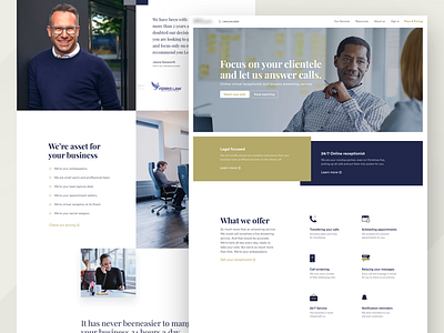
Design is all composed around accessibility for users. I have avoided any obscure copy texts which are often unclear and instead used simple and straightforward headlines.
I really liked Steve's Krug book "Don't make me think" and that is exactly what I tried to apply here. I wanted user to know what he is reading/looking at immediately without giving second thoughts to it.
And this is what I did
1. When user visits the page he is ensured that he is on the right place with understandable and straightforward headline copy.
2. User is given 2 primary services that product offers followed by simple preview of others.
3. In following section user is presented with information that he gets after signing up.
4. All of that is supported by social proof of some nice numbers and testimonials.
5. A sneak peak of who is actually going to work for you.
However, at the end, client had decided to go with different version done by my colleagues.


