Maybe this style of icons isn't suitable for this specific company. Which is fair and totally normal. This doesn't mean though it can't be used for another one. Great sketches. Getting a pencil and working around with sketches is a beautiful and rewarding process. GJ!
20 Responses
Pro
Jackie Tran Anh
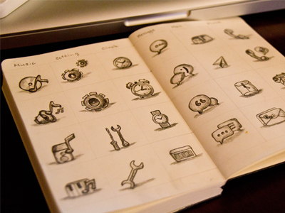
Some rejected icons I made for HTC company.
Bigger view
about 1 year ago
Beautiful drawings
about 1 year ago
Pro
Prekesh Chavda
Why? :C
about 1 year ago
Pro
Dennis Covent
Rejected??
about 1 year ago
Pro
Julian Burford
neat :)
about 1 year ago
Pro
Jackie Tran Anh
@Prekesh Chavda the sketches are not suitable..
about 1 year ago
why rejected ?
about 1 year ago
Pro
Yoga Perdana
icon bible!
about 1 year ago
Pro
Zane David
The only rejects are the clients!
about 1 year ago
Pro
Alexander Spliid
more like the icons rejected the client
about 1 year ago
icons they want more serious? because they were amazing
about 1 year ago
Pro
Frantisek Kusovsky
Still epic experience to work on something for company like HTC, isnt it?
about 1 year ago
Pro
Rodrigo Grundig
Maybe this style of icons isn't suitable for this specific company. Which is fair and totally normal. This doesn't mean though it can't be used for another one. Great sketches. Getting a pencil and working around with sketches is a beautiful and rewarding process. GJ!
about 1 year ago
Pro
Zachary Burghardt
Rejection never looked so good!
about 1 year ago
Wow :D
about 1 year ago
@Jackie Tran Can you tell me where to get this type of journal with divisions?
And as for the icons, shame on HTC. These are pretty cool. :D
about 1 year ago
Jackie - amazing drawings! how long does it take you to make these?
about 1 year ago
Pro
Roman Rudnik | IconDesignLAB
Really cool scetches!
about 1 year ago
nice!
about 1 year ago
Pro
Garrett Godsey
Damn son. These are nice.
about 1 year ago