


Mountain Lion Dock Concept

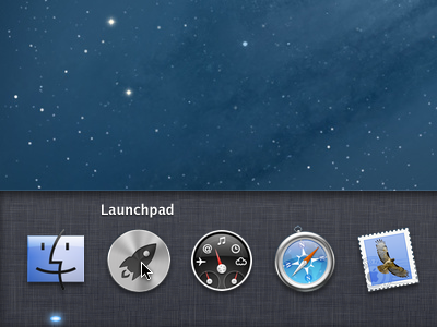

What if Mountain Lion treated the Dock (and Launchpad) the same way it treats Notification Center?
[Make sure to check out the full-size image and the mockup video of how it might behave.]
Caveats:
- Just a mockup, nothing fancy
- Used Apple's design cues, didn't stray from their example
- Threw this together in a couple hours, please don't judge me :)
MoloDock.mp4
2 MB


