There's more now

21 Responses

  1. Chris Beaumont Chris Beaumont

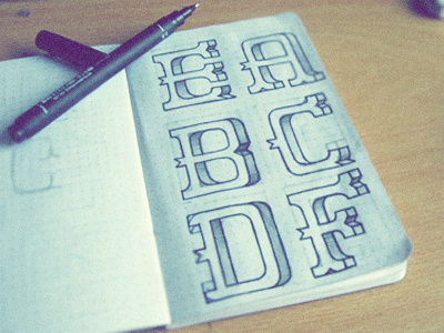
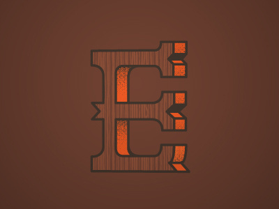
    Been expanding on the original letter E, slowly building up the collection in any spare time I get.
    Any advice greatly appreciated.

    about 1 year ago

  2. George Wiltshire George Wiltshire

    Oh yesssssss indeeed. love them all

    likes

    about 1 year ago

  3. Pro Herson Rodriguez Herson Rodriguez

    This looks really good

    likes

    about 1 year ago

  4. Chris Beaumont Chris Beaumont

    @George Wiltshire @Herson Rodriguez Thanks guys, relief getting good feedback straight away.
    I'm up to M so far, although G doesn't look right to me and now O is being a bit of a bitch, so I'm slowly getting there.

    about 1 year ago

  5. George Wiltshire George Wiltshire

    I can imagine O being a problem ;p

    likes

    about 1 year ago

  6. Bob Ewing /// creative WHAT! Bob Ewing /// creative WHAT!

    Looks really rad Chris, can't imagine the time you have been putting into this it. It is worth that that is all I am saying.

    likes

    about 1 year ago

  7. Pro Timothy J. Reynolds Timothy J. Reynolds

    nice. really like the D.

    likes

    about 1 year ago

  8. Andrey S. Rodrigues ☝ Andrey S. Rodrigues ☝

    really nice

    likes

    about 1 year ago

  9. Chris Beaumont Chris Beaumont

    Cheers for all the positive comments everyone
    @Bob Ewing Luckily the time hasn't got to me because it's been a slow project for spare time. glad it's worth it though.
    @Timothy J. Reynolds thanks, I've been plating around with the D quite a lot to try and get the serifs right.
    @Andrey S. Rodrigues glad you like it

    about 1 year ago

  10. Pro Gert van Duinen Gert van Duinen

    Wonderful man.

    likes

    about 1 year ago

  11. Chris Beaumont Chris Beaumont

    thanks @Gert van Duinen always know i'm heading in the right direction when you like it.

    about 1 year ago

  12. Jack Bentley Jack Bentley

    Seriously nice Chris.

    likes

    about 1 year ago

  13. David Elliott David Elliott

    Sexy!

    likes

    about 1 year ago

  14. Ivaylo Nedkov Ivaylo Nedkov

    Nice sketches Chris!:)

    likes

    about 1 year ago

  15. Claire Coullon Claire Coullon

    Great to see this Chris, fantastic extension of your original letter. (I almost prefer this without the texture/fill effects actually.) 'F' is especially good and I can totally see how some letters must be really hard to develop with this sort of approach. Definitely working so far though!

    likes

    about 1 year ago

  16. Chris Beaumont Chris Beaumont

    Thank you @Claire Coullon really glad to hear you like it. F is one of the only ones that worked straight away.

    likes

    about 1 year ago

  17. Pro Sye Robertson Sye Robertson

    NIce work. I recommend http://typedrawers.com if you want feedback and discussion all about drawing letters. :-)

    likes

    12 months ago

  18. Chris Beaumont Chris Beaumont

    @Sye Robertson Cheers, that's a great link I'll be using that in future. Really appreciate the help

    likes

    12 months ago

  19. Daniel Golden Daniel Golden

    Even more da bomb.

    likes

    12 months ago

  20. Since it's been ages since I sketched the ideas for this I decided I just needed to sit down and get it done. After a late night of designing and plenty of coffee I ended up with this. Inspired by shop signs seen in the Clint Eastwood film Pale Rider.

    Not too sure on how to make this into a working font so I'm still deciding what to do with it. Any advice on either what to do or on the design itself very welcome.

    10 months ago

  21. Pro Anna Niess Anna Niess

    super sexy.

    likes

    10 months ago

keyboard shortcuts: previous shot next shot L or F like