Find designers
Designer search
Quickly find your next designer
Post a job
The #1 job board for design talent
Inspiration
Courses
UX Diploma
Learn UX design from scratch in 6 months
UI Certificate
12-week UI skill building for designers
Live interactive workshops
with design professionals
Jobs
Go Pro
Log in
Dribbble: the community for graphic design
Advance your career with a Professional Diploma in UX Design
Learn more
Log in
Sign up
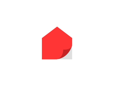
RennoReady Logo
Sean Farrell
Available for work
Follow
Following
Like
Get in touch
#FFFFFF
#FC3434
#DBC0BE
#EC5A5A
#F0A0A0
Download color palette
Trying a minimalistic approach to a house renovation logo. Have you seen something like this before?
design
logo
new
peel
ready
refresh
renovate
View all tags
Posted on Mar 12, 2012
12,978
57
386
45
View feedback
Sean Farrell
Logos that mean something.
Get in touch
More by Sean Farrell
View profile
Previous
Next
Loading…
Loading…
Loading…