Shopping List

Prevew

41 Responses (page 1 of 2)

  1. Asher Asher

    Full View

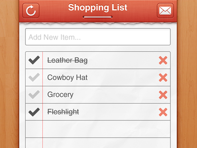
    Trying to improve myself at UI design.

    It's still a work in progress, so all suggestions and criticism will be appreciated.

    Thanks my twitter followers :)

    PS: Don't mind the half-pixels in this preview; check the full size ;)

    Original: http://d.pr/UIFH

    about 1 year ago

  2. Pro Mathieu Berenguer ▲▼▲ Mathieu Berenguer ▲▼▲

    Nice dude !

    about 1 year ago

  3. Pro Umar Irshad Umar Irshad

    Ghakas :D good work dude! btw its not client work?

    about 1 year ago

  4. Asher Asher

    @Umar Irshad It's for a client.The only difference is that I am not sure if I am going to get paid XD

    likes

    about 1 year ago

  5. Pro Andrea Cau Andrea Cau

    Love the first draft you post on Twitter. Much more original than this. Btw really beautiful work man!

    about 1 year ago

  6. Pro Robert van Klinken Robert van Klinken

    Nice one dude. Personally I'd make all the icons a little smaller. And use the same margins here. Great start!

    likes

    about 1 year ago

  7. Pro Jip Jip

    Super crisp!

    about 1 year ago

  8. Muhammad Bilal ☁ Muhammad Bilal ☁

    awesome work dude. love the staple pin effect on header.

    about 1 year ago

  9. Jonathan Mazaltov Jonathan Mazaltov

    Interesting shopping list you got there, just sayin' :P

    likes

    about 1 year ago

  10. Asher Asher

    @AndyTheJoker You like this version more? In both cases, I win ;)

    @Robert van Klinken Thanks for the pointer - http://d.pr/NIIQ

    @Jonathan Mazaltov It's a typo :D

    likes

    about 1 year ago

  11. Pro Kubilay Sapayer Kubilay Sapayer

    @Asher share that wood texture

    likes

    about 1 year ago

  12. Jonathan Mazaltov Jonathan Mazaltov

    @Asher LOLz

    about 1 year ago

  13. Pro Guillaume Gaubert Guillaume Gaubert

    That's a really good start! I like it.
    Tough, I'd resize down the tick a bit, and resize down the delete icon even more and maybe set its color to light gray to make it less visible.
    That pin in the navigation bar is awesome!

    likes

    about 1 year ago

  14. Ray Martín Ray Martín

    Does it make me dirty that I am, presumably, the only one who noticed the last item?

    likes

    about 1 year ago

  15. Clay Cauley Clay Cauley

    Oh no @Raymundo Martín I noticed. Took me a minute to realize that it wasn't Flashlight where the strike through made the 'a' look odd ... but it was, in fact, Fleshlight.

    No judgement here.

    likes

    about 1 year ago

  16. Juan Gomez Juan Gomez

    leather bag, cowboy hat and a fleshlight ? what are you planning ?

    likes

    about 1 year ago

  17. Pro Julien Martin Julien Martin

    Except for the UI elements non-standard sizes (navbar, tab bar, tableview cells), everything is DELICIOUS!

    about 1 year ago

  18. Pro Jake Kwaschnefski Jake Kwaschnefski

    "Fleshlight" HAHAHAHAH! Anyways, I really like this. I'm not sure if I'm liking the font used for the items. I also think the different views down at the bottom look too similar to each other. But other than that, I'm really diggin it.

    about 1 year ago

  19. Pro Andrea Cau Andrea Cau

    @kyotux Yep! You win in that shot. :D

    about 1 year ago

  20. Pro Mikkel Aggerbo Mikkel Aggerbo

    Looks cool, I just did a shot with a torn paper just before you. So now I have two pictures with torn paper under my following sector. I guess the torn paper is overused :(

    I do think the paper that are torn is a bit tacky, a bit to perfect maybe?

    When I did my torn paper, I actually shredded a paper into to pieces, scanned one of them and traced the outcome in Illustrator. Feel free to have a look at the result:

    http://dribbble.com/shots/467626-Torn-paper-Again-?list=following

    Keep us updated on the project :)

    about 1 year ago

  21. Asher Asher

    @Kubilay Sapayer You can get it here.

    @Julien Martin I compared the dimensions with the template and both navbar and tab bar were only 1-2px off.I've fixed them though :)

    @Mikkel Aggerbo You are right! Making torn paper is tricky indeed.Some one suggested to use "Freeform Pen Tool" and I might try it as well.

    likes

    about 1 year ago

  22. Juan Gomez Juan Gomez

    lol @Mikkel Aggerbo , i just uploaded one too :P

    about 1 year ago

  23. Pro Kubilay Sapayer Kubilay Sapayer

    @Asher where ?

    likes

    about 1 year ago

  24. Pro Eddy Gann Eddy Gann

    I agree with @AndyTheJoker. I like the other version. Both are great, of course.

    likes

    about 1 year ago

  25. Pro Philip Litassy Philip Litassy

    Nice and sharp. :)

    about 1 year ago

keyboard shortcuts: previous shot next shot L or F like