Find designers
Designer search
Quickly find your next designer
Post a job
The #1 job board for design talent
Inspiration
Courses
UX Diploma
Learn UX design from scratch in 6 months
UI Certificate
12-week UI skill building for designers
Live interactive workshops
with design professionals
Jobs
Go Pro
Log in
Dribbble: the community for graphic design
Advance your career with a Professional Diploma in UX Design
Learn more
Log in
Sign up
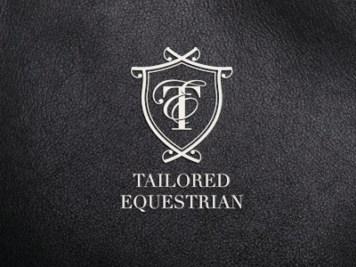
Tailored Equestrian
Sean O'Grady
Available for work
Follow
Following
Like
Get in touch
#29282C
#3E3D42
#A19F9C
#807F7F
#C4C2BC
#E8E6DE
Download color palette
Logo proposal for equestrian supplies company.
cream
crest
equestrian
horse
identity
leather
logo
View all tags
Posted on Mar 12, 2012
2,929
5
59
14
View feedback
Sean O'Grady
Logo & Brand Designer. Where Ideas Shape Identity.
Get in touch
More by Sean O'Grady
View profile
Previous
Next
Loading…
Loading…
Loading…