Healthcare Landing Page Shot

Healthcare-landing-page-shot

1 Attachment

18 Responses

  1. Brad Haynes Brad Haynes

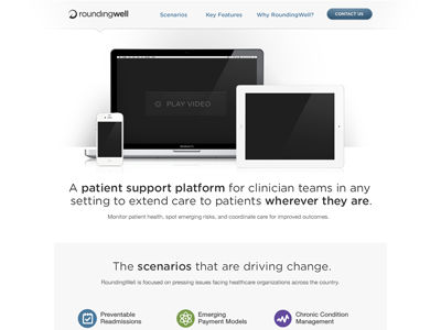
    Landing page for a friend's healthcare startup. Will be dropping in the screenshots into the different devices in the comp. Launching this in the next few days. Simple-inspired header.

    over 1 year ago

  2. Christopher Magruder Christopher Magruder

    Looks nice and clean. Good work

    likes

    over 1 year ago

  3. Alan O'Connor Alan O'Connor

    Hey Brad, really like the page, simple, clean, really well balanced. Also great highlighting of the key messages within the page for those users who are just glancing.

    One key thing I would do from a marketing/sales point would be to increase the cta presence on the page. This could be simply to capture their contact details or sign them up for a free trial etc. Either way as a start up they will want to optimize and sell as much as they can. Your key areas to do this would be before the scenarios content area, at the end of each column in the scenario section and at the end of the tab checks. Maybe do this in the same style as the signup and contact buttons.

    As always solid, solid job

    likes

    over 1 year ago

  4. Ondrej Lechan Ondrej Lechan

    beautiful job! i like purity of design

    likes

    over 1 year ago

  5. Alex King Alex King

    nice and clean...sweet!!

    likes

    over 1 year ago

  6. Jordan Price Jordan Price

    I like the rounded typeface choice (what is it?). It works well with the clean/ soft vibe.

    over 1 year ago

  7. Brad Haynes Brad Haynes

    @Jordan Price Gotham Rounded. One of the many beautiful typefaces from Hoefler & Frere-Jones.

    likes

    over 1 year ago

  8. Sacha Greif Sacha Greif

    Are you counting on H&FJ's elusive webfont service to implement this?

    likes

    over 1 year ago

  9. Peter Fabricius Peter Fabricius

    So clean. Great work Brad.

    likes

    over 1 year ago

  10. Project 365 Project 365

    no webfonts available yet for Gotham is there?

    over 1 year ago

  11. Richard Barnes Richard Barnes

    Beautiful and clean, best remedy for a healthcare project... sorry! :)

    likes

    over 1 year ago

  12. Brad Haynes Brad Haynes

    @Sacha Greif Yeah, I know. I think they are considering a corporate font switch to Nova Proxima, which is kinda close, in order to use Typekit instead of having to resort to Cufon, or even more archaic means :) /cc @Project 365

    over 1 year ago

  13. Wes Oudshoorn Wes Oudshoorn

    Did you remove the full screenshot? Was looking for some inspiration but seem to have lost the full view ;)

    likes

    over 1 year ago

  14. Brad Haynes Brad Haynes

    @Wes Oudshoorn It's re-attached. Sorry about that!

    over 1 year ago

  15. Wes Oudshoorn Wes Oudshoorn

    Really thought I had gone mental and imagined the rest of the page. Thanks for sharing, great great page (everybody loves whitespace!).

    likes

    over 1 year ago

  16. Project 365 Project 365

    had to switch to proxima myself for a new project

    likes

    over 1 year ago

  17. Avinash Tripathi Avinash Tripathi

    very clean with lovely information flow!

    about 1 year ago

  18. Kay in t Veen Kay in t Veen

    Great design, love it!

    12 months ago

keyboard shortcuts: previous shot next shot L or F like