Grey Sloan Memorial Hospital Brand Identity


Most of my friends would probably know this, but I'm a total Grey's Anatomy fan. It's by far one of my favorite shows and it's really well done, but the one thing that always irritated me was the treatment of each hospital brand: from Seattle Grace Mercy West to Grey Sloan Memorial Hospital. The logos just never changed a bit, and the whole idea of the name change to Grey Sloan was to do something new.
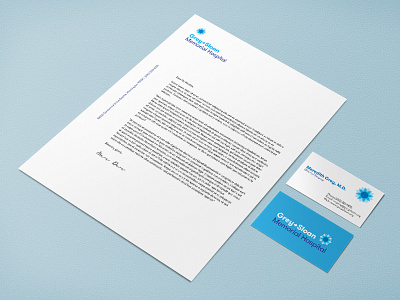
My sketches lead me to the idea of the Dahlia. Not only is it the state flower, but the concept is two-fold: a) it represents the bond between the characters Lexie Grey and Mark Sloan; whose memories the hospital was dedicated to; and b) it represents the new mission sought after by the founders of GSMH, who survived a traumatic plane crash which killed both Lexie Grey and Mark Sloan.
The bold, yet monochromatic palette of blues keeps the brand feeling trustworthy in the face of new beginnings. I'm still looking to build on this a bit more, but these are the items for now!


