Teenage Mutant Ninja Typography

Another post following the daily prompt from CommonPencil, a group design blog I'm a member of.
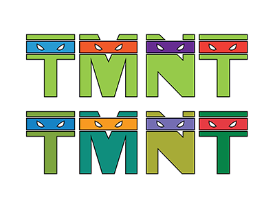
Friday's CommonPencil prompt was Teenage Mutant Ninja ________. As a childhood fan of the ninja turtles, I loved the chance to play with this prompt. I also liked seeing what happened to the turtles since I was a kid.
The turtles in the 80's/90's were (like the logo on the top) an almost neon green with super saturated eye bands. Now, the turtles are like anime characters and they all have slightly different shades of green and more unique eye band colors (see the logo on the bottom). I can't complain though, it's nice to see current generations of kids enjoying something I liked too.


