
Secret
Here is a secret design for a new app we are working on. What do you guys think so far?
August 17, 2010
This shot is a Rebound of...
Secret
by Jeff Broderick Pro
keyboard shortcuts: ← previous shot → next shot L or F like


44,236,852,244 pixels dribbbled
16 Responses
Pro
Jeff Broderick
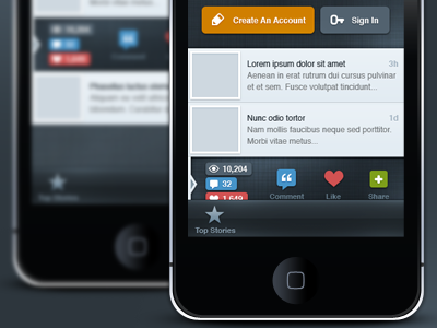
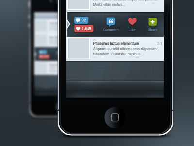
Here is an updated version. Please let me know what you guys think!
almost 2 years ago
Woah! Look's awesome, Jeff ! :)
almost 2 years ago
Pro
Andrew-David Jahchan
Looking good! And that key icon reminds me of the one Rogie is using here: http://drbl.in/46307
almost 2 years ago
So it's definitely not a dribbble app. Still not sure what it is for though.
It looks slick Jeff. You've done an awesome job with it!
almost 2 years ago
Pro
Jeff Broderick
@andrew: yup, it was inspired by him. I talked to him about it, no worries! :D
Thanks guys!
almost 2 years ago
Not a fan of how there is an unclickable element right next to clickable elements. Maybe a separator of sorts?
almost 2 years ago
very slick looking. good job
almost 2 years ago
This is truly impressive!
almost 2 years ago
Pro
Michael Spitz
Very tight!
almost 2 years ago
Pro
Umar Irshad
slick!!!
almost 2 years ago
Pro
Hillary Hopper
Love it. Just curious as to what it's for!
almost 2 years ago
Pro
Patrick Algrim
Would a pencil be the right icon for creating an account? To me that visually says edit. Just a tip. Realize it's not finished, much love Broderick.
almost 2 years ago
Pro
David Lanham
Why the repeated elements? There's no reason why Comment and Likes couldn't be a button and a status indicator with the views as subtext and a third button for Share. Then you'd only have 3 buttons. Great otherwise, especially the color palette.
almost 2 years ago
Pro
Jeff Broderick
Yeah, I thought about that. Temporarily I went with this, I will re-visit that idea though. Thanks!
almost 2 years ago
I think as well that the text only elements should be separated from the links. The triad of blue, red and green was doing fine on its own, before orange showed up. In this case four is a bit of a crowd, especially since the background doesn't flatter that particular shade of orange. I would also put a stronger delimiter for the bottom bar or increase the contrast between it and the details area. Unless they are connected somehow?
almost 2 years ago
it's a "Secrets" app ^^ ?
over 1 year ago