My First Icons

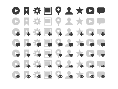
In preparation for an upcoming personal project, I decided to take my first stab at designing a set of icons. I'm generally pleased at the result so far, but I didn't have high expectations for my first time out.
There are certainly some rough edges to work out, but I'm not sure how to approach them. It also doesn't seem as cohesive as it should be. I'm open to any suggestions on how to improve my first foray into the world of icons.


