Dot Plots

Dot Plots are an adaptation of the Bar Graph which are specifically useful for comparing values outside of a zero baseline. By eliminating the need to show the full value range of a number, you can begin to see the very small differences in values of a small range.
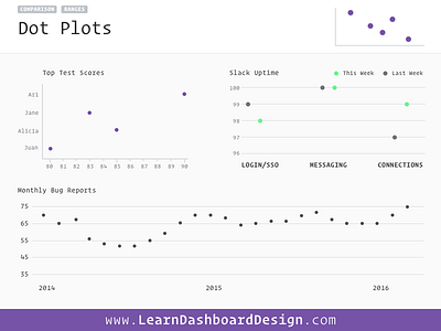
For example, here I’m depicting the ‘Top Test Scores’ which range from 80 to 90. If I had used a bar chart showing the full 0–100 range, these subtle differences between the scores would be nearly invisible. However, when you scale the x-axis values as I’m showing here, the differences are much more visible. By using dots instead of bars we also eliminate the possibility of user’s assuming a zero-based axis and dramatizing the chart’s subtle differences.
They’re also useful to reduce the visual weight of a chart on a dashboard. By using dots instead of bard, the ink/data ratio goes down and our heavy bars demand less of the user’s visual attention.


