Find designers
Designer search
Quickly find your next designer
Post a job
The #1 job board for design talent
Inspiration
Courses
UX Diploma
Learn UX design from scratch in 6 months
UI Certificate
12-week UI skill building for designers
Live interactive workshops
with design professionals
Jobs
Go Pro
Log in
Dribbble: the community for graphic design
Log in
Sign up
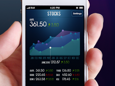
Stocks full view
Andrei Korytsev
Follow
Following
Like
#090A1E
#D1A9A7
#1D2F4E
#673A38
#486888
#22546F
#9D534A
#E6DADE
Download color palette
blue
diagram
finance
ios
iphone
stock
stocks
View all tags
Posted on Mar 7, 2012
19,421
108
385
22
View feedback
Andrei Korytsev
More by Andrei Korytsev
View profile
Previous
Next
Loading…