No offense dude, I love your work, just not feeling this one. Combining too many weird styles and colors. All the lighting seems pretty inconsistent as well. The top of the email field is just cut off in a very harsh line, also the stitching on top just has a drop shadow, so it looks like little lines sitting on top of the leather rather than how the stitching would be with a horizontal gradient going from dark on the edges to light in the middle to simulate the actual real world material. Just my opinion, would love to see you play with it more.
37 Responses (page 1 of 2)
Pro
Jonatan Castro
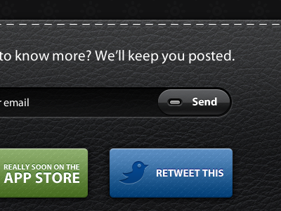
Client work. This is the teaser website, We're currently working on the application UI.
www.luxylightapp.com
over 1 year ago
texture :)
over 1 year ago
Pro
Chris Wallace!
That texture is great. Please give it to me.
over 1 year ago
Pro
Sergio Alvarez
Wow... amazing texture dude!
over 1 year ago
Pro
Jonatan Castro
Thanks guys. Texture is here: http://cl.ly/20Ph
over 1 year ago
Pro
Oscar Barber
Awesome texture! ;)
over 1 year ago
Pro
Pek Pongpaet
I was gonna say - where did you get the awesome texture. Great work!
over 1 year ago
Pro
Michael Dravnieks
Love the texture on the buttons too.
over 1 year ago
Pro
Stéphane Reverdy
The whole teasing page is nice. Excellent work.
over 1 year ago
Amazing work! Really nice. I wait the application UI.
over 1 year ago
Pro
Will Hindson
Everything is nice but I love the detail and shine of the send button!
over 1 year ago
Pro
Robin Raszka
Hehe, very nice indeed... You like Dribbblr's website don't you 8))
over 1 year ago
Pro
Jonatan Castro
I love it Robin :P. Where is my like???? :P
over 1 year ago
Pro
David Calhoun
Awesome texture and buttons. :)
over 1 year ago
The texture is perfect, and I love the styling of that little LED in the middle of the button. Great job!
over 1 year ago
Pro
Alex Pankratov
Do the buttons have bit of a texture show-through?
(edit) May want to test the page in Firefox 3.x. The text in the input field sits too low compared to the Mac version.
over 1 year ago
Pro
Lee Salisbury
Now you just need to get them to redo the branding for luxylight. Not near as nice as your UI.
over 1 year ago
Pro
Jonatan Castro
@Josh: middle? :P. Thanks man!
@Alex: yes thanks, I will take a look!
@Lee: why man? could you explain a bit more? thanks!
over 1 year ago
nice.
the brand mark is a bit hard to look at because of the rendered cloud overlay (or similar effect) http://www.sylion.com/luxylightapp/img/logo.png
over 1 year ago
AWESOME
over 1 year ago
Pro
Marco Sousa
oh yeah, that's an interface you want to click, touch, make love to...wot...wait? nvm :P
over 1 year ago
Pro
Ismael Burciaga
I love the stitching you have going on here!
over 1 year ago
this is sweeet, not sure about the type on the logo but other than that great job ;)!
over 1 year ago
Pro
Erica Schoonmaker
Love that leather texture, thanks for linking it!
over 1 year ago
Pro
Mac Tyler
No offense dude, I love your work, just not feeling this one. Combining too many weird styles and colors. All the lighting seems pretty inconsistent as well. The top of the email field is just cut off in a very harsh line, also the stitching on top just has a drop shadow, so it looks like little lines sitting on top of the leather rather than how the stitching would be with a horizontal gradient going from dark on the edges to light in the middle to simulate the actual real world material. Just my opinion, would love to see you play with it more.
over 1 year ago