Find designers
Designer search
Quickly find your next designer
Post a job
The #1 job board for design talent
Inspiration
Courses
UX Diploma
Learn UX design from scratch in 6 months
UI Certificate
12-week UI skill building for designers
Live interactive workshops
with design professionals
Jobs
Go Pro
Log in
Dribbble: the community for graphic design
Log in
Sign up
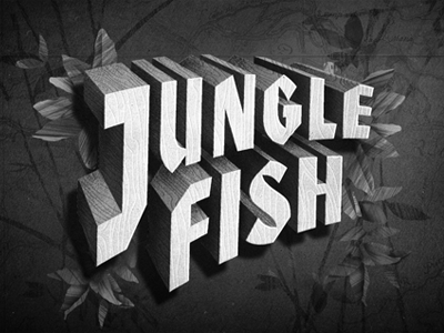
Jungle Fish
Canales & Co.
Available for work
Follow
Following
Like
Get in touch
#262626
#535353
#E6E6E6
#969696
Download color palette
Revised film title.
black
film title
illustration
leaves
type
vintage
white
woodgrain
View all tags
Posted on Mar 6, 2012
6,625
23
227
22
View feedback
Canales & Co.
Welcome to our design portfolio on Dribbble
Get in touch
More by Canales & Co.
View profile
Previous
Next
Loading…
Loading…
Loading…