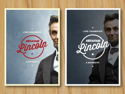
Redesign the Classics #1: Abraham Lincoln

23 Responses

  1. Peter Voth Peter Voth

    Wich one you would prefer? Left or right? Thanks for your suggestions!

    likes

    over 1 year ago

  2. George Wiltshire George Wiltshire

    Tough one. I would say left!

    likes

    over 1 year ago

  3. Jen Lea Jen Lea

    I prefer the colours on the left as I think they add more to the Americana nature of the image. However, I prefer the layout on the right as it has more impact and feels modern. What about a combo of the two?

    likes

    over 1 year ago

  4. George Wiltshire George Wiltshire

    Yeah after looking at it further i'de defo say left, the colours really grab you a lot more than the right version. I really like the variation of the blues. :)

    likes

    over 1 year ago

  5. Alexander Slyusar Alexander Slyusar

    Left!

    likes

    over 1 year ago

  6. Kevin Burr Kevin Burr

    I agree with Jen. I also like how the text on the right overlaps the Abe photo. Perhaps try the right layout with the left colors. Looking good, Peter.

    likes

    over 1 year ago

  7. Shane Helm Shane Helm

    Tough choice. I like both. But think I'll go with red one for the patriotic feel.

    I like seeing a little more of Lincoln though like in the right one.

    likes

    over 1 year ago

  8. Devon Henderson Devon Henderson

    Ahhh, so hard to choose! I agree with what was said above — the layout of the right one feels more solid, but the left one's color really makes it pop. Good luck choosing!

    At least the fact that it's so hard to choose means both are great for the job, right? ;)

    likes

    over 1 year ago

  9. Tiffany Israel Tiffany Israel

    I like left, but with Abe's composition from the one on the right. The colors in the left one are great! BUT I don't like the red of "Abraham Lincoln" and the circle, it's either too much red, or the flatness of the red and the blue compared to the contrast of the white on black on the right. Something about it seems off to me.

    Two great options though.

    over 1 year ago

  10. Seth Rexilius Seth Rexilius

    I think it depends on the emotion you're trying to evoke. The right answer isn't one's personal preference, but what best suits the client's needs.

    The one on the left is more inviting. Warmer. The colors suggest the content inside is light-hearted. The one on the right sets a more ominous tone. Mysterious. Something tragic inside.

    Which design better fits the content it's representing? That's the right answer, IMHO.

    likes

    over 1 year ago

  11. Peter Voth Peter Voth

    @Seth Rexilius ... I think your thoughts are right. But it´s just a personal project I made for fun ... so, there will be no final selection ;-)

    over 1 year ago

  12. Katie Rhea Stokes Katie Rhea Stokes

    left!

    likes

    over 1 year ago

  13. Jonathan Ogden Jonathan Ogden

    I'd say right. Not sure about that dark red on the blue, doesn't feel as clear as the one on the right, which looks really bold and cool.

    likes

    over 1 year ago

  14. Justin Garand Justin Garand

    This my friend is badass

    likes

    over 1 year ago

  15. Ryan B. Clark Ryan B. Clark

    I just realized I've spent about 10 minutes staring at these, trying to decide which to choose, as if a kitten would die if I picked the wrong one.
    I'm leaning toward the right. It'd be cool to see it use some of that red though.

    likes

    over 1 year ago

  16. Stella Lai Stella Lai

    Although the one on the right is more minimal and mysterious, I prefer the one on the left, it definitely adds more character and interest. It is more aesthetically pleasing to me.
    But regardless of which one you decide to go with, they are both very strong pieces. Great job Peter!

    likes

    over 1 year ago

  17. George Wood George Wood

    Left for me.

    likes

    over 1 year ago

  18. Farzad Ban Farzad Ban

    Right.

    likes

    over 1 year ago

  19. Peter Voth Peter Voth

    Thanks for all the kind words and suggestions, guys ... I appreciate it very much!!!

    over 1 year ago

  20. Nick Slater Nick Slater

    I love the both! Keep up the great work!

    likes

    over 1 year ago

  21. Kyle Willis Kyle Willis

    Whoa, these are so sick. I would have to say left, but I love the right. Can't wait to see this.

    likes

    over 1 year ago

  22. Peter Voth Peter Voth

    Appreciate your kind words very much ... @Nick Slater @Kyle Willis

    over 1 year ago

  23. Dane Dane

    The color on the left is too good to pass up.

    likes

    over 1 year ago

keyboard shortcuts: previous shot next shot L or F like