Find designers
Designer search
Quickly find your next designer
Post a job
The #1 job board for design talent
Inspiration
Courses
UX Diploma
Learn UX design from scratch in 6 months
UI Certificate
12-week UI skill building for designers
Live interactive workshops
with design professionals
Jobs
Go Pro
Log in
Dribbble: the community for graphic design
Advance your career with a Professional Diploma in UX Design
Learn more
Log in
Sign up
App for iPad
Ashish Thakkar
Available for work
Follow
Following
Like
Get in touch
#2B2B2B
#F1F1F1
#BABECC
#5A5A5A
#2AA0D7
#DE853F
#594621
Download color palette
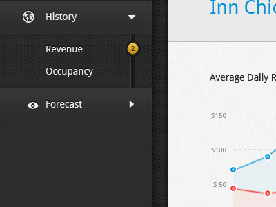
Here is a full view of app... feedback always appreciated
app
dark
dashboard
graph
gui
interface
ipad
texture
ui
View all tags
Posted on Mar 4, 2012
2,708
12
57
8
View feedback
Ashish Thakkar
Get in touch
More by Ashish Thakkar
View profile
Previous
Next
Loading…
Loading…
Loading…