Apple Keyboard

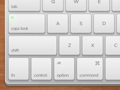
I've always loved the minimal Apple wireless keyboard and the pixel perfect WebOS keyboard. I had some free time today so i made a mashup of both. I'll make a black version soon.
I've always loved the minimal Apple wireless keyboard and the pixel perfect WebOS keyboard. I had some free time today so i made a mashup of both. I'll make a black version soon.


