Iron to Iron Stationary

When creating the new Iron to Iron website I knew that I wanted the site to contain a heavy contrast of simple colors to not only give depth to the design but to also provide a clear visual distinction between certain sections of the site. A positive by product of this formula is that it also creates an ideal framework for showcasing client work.
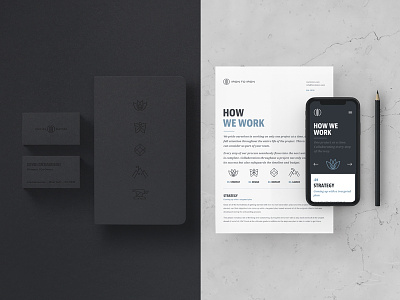
Phase two of the launch includes updating our supportive materials to match the updated brand. Creating black on black print materials has always been alluring to me. However, it’s not particularly efficient for all resources; specifically documents with large amounts of content. Therefore, utilizing the same design formula (a balance of high contrast to provide distinction) seems to be working great for our new stationary and printed materials. It combines the allure and artistry of “design for the sake of design” with usability when needed.
Business cards, notebooks and a few printed documents. Not much else a Web company needs!


