Find designers
Designer search
Quickly find your next designer
Post a job
The #1 job board for design talent
Inspiration
Courses
UX Diploma
Learn UX design from scratch in 6 months
UI Certificate
12-week UI skill building for designers
Live interactive workshops
with design professionals
Jobs
Go Pro
Log in
Dribbble: the community for graphic design
Log in
Sign up
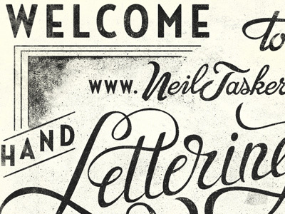
Welcome to
Neil
Available for work
Follow
Following
Like
Get in touch
#F7F7EA
#272725
#C5C5BA
#5F5F59
#42423D
#84847C
Download color palette
just playing around with putting it all together
design
lettering
neil
tasker
typography
View all tags
Posted on Mar 1, 2012
3,349
7
121
22
View feedback
Neil
Get in touch
More by Neil
View profile
Previous
Next
Loading…
Loading…
Loading…