Shot_1281710094

13 Responses

  1. Pro Tobias Wiedenmann Tobias Wiedenmann

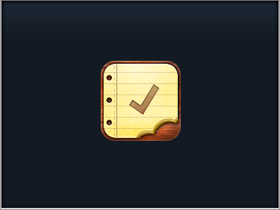
    Worked a little bit more on this one today.

    - new wood texture
    - less 3D (looked kinda wrong next to the default apps)
    - only 3 holes
    - more light from above, to match default apps lighting
    - some other minor stuff I can't remember.

    almost 3 years ago

  2. Marcus Lindgren Marcus Lindgren

    Amazing!

    The check mark needs to be just a bit darker tough, and I like the way the bite was before, more symmetrical.

    But this is a definite improvement.

    likes

    almost 3 years ago

  3. Andrea Austoni Andrea Austoni

    I like everything about this. I'm dying to see the 29px version!

    almost 3 years ago

  4. Pro Benjamin De Cock Benjamin De Cock

    Awesome. And Marcus is right about the check mark imho ;)

    almost 3 years ago

  5. Hillary Hopper Hillary Hopper

    Great improvement.

    almost 3 years ago

  6. Pro Daniel Waldron Daniel Waldron

    I like everything about this icon how it is now. It complements the UI perfectly in my opinion. It has your style.

    almost 3 years ago

  7. Pro Tobias Wiedenmann Tobias Wiedenmann

    Thx Daniel.
    I'm also much happier about it now. :)

    almost 3 years ago

  8. Taylor Barriger Taylor Barriger

    Nummmm...

    almost 3 years ago

  9. Pro Iconfinder Iconfinder

    Yummy!

    almost 3 years ago

  10. over 2 years ago

  11. over 2 years ago

  12. Nathanael Jeanneret Nathanael Jeanneret

    The bite mark in the layers of paper is most delightful :)

    over 2 years ago

  13. The category icons for my upcoming app, that are are already finished. Some more left to do...

    over 2 years ago

keyboard shortcuts: previous shot next shot L or F like