Getbelongings iphone app

Shot2

1 Attachment

26 Responses (page 1 of 2)

  1. Pro zee7 ✽ zee7 ✽

    .
    Full-View

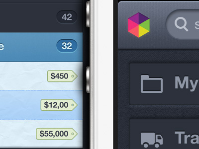
    Sharing first screen of iphone version. It was a bit challenging as client wanted to keep it same as ipad visual, after couple of revisions, i come up with this. Still not sure about the positioning of 'logo' and 'plus' icons.

    Any thoughts?

    about 1 year ago

  2. Asher Asher

    Where's the leather tab bar :P ?

    likes

    about 1 year ago

  3. Pro Murray Clark Murray Clark

    Looks great zee, bit much inner shadow on the search bar in my opinion.

    likes

    about 1 year ago

  4. Pro zee7 ✽ zee7 ✽

    @Asher its in another screen which comes up when you press for any category e.g. chair tab in this shot. wo finish ho gaee howi hai, jald hi share karoun ga. its very sexy :D

    likes

    about 1 year ago

  5. Pro Avinash Tripathi Avinash Tripathi

    intezaar hai ji...

    likes

    about 1 year ago

  6. Pro Mads Ejsing Mads Ejsing

    I don't like the paper texture on the light areas (it feels unnecessary and inelegant) and the dissolved strokes between them.

    Besides that, it looks absolutely amazing!

    likes

    about 1 year ago

  7. Pro zee7 ✽ zee7 ✽

    about 1 year ago

  8. Pro Tanveer Junayed  Tanveer Junayed 

    Looking great bro! I think all elements are perfectly placed. But I prefer leather effect.

    likes

    about 1 year ago

  9. Pro Afraz Afraz

    Everything is great except the "Plus" icon on top right. It's looking regular iPhone style :|

    likes

    about 1 year ago

  10. Pro Robert van Klinken Robert van Klinken

    Contrast is big. Design is insane!

    likes

    about 1 year ago

  11. Pro Umar Irshad Umar Irshad

    @Asher, @zee7 ✽ showed me the screen with the leather tab bar it sure as hell looks sexy :D

    Great work as usual Zulal :)

    likes

    about 1 year ago

  12. Pro Umar Irshad Umar Irshad

    Ohh btw Zulal, work on that "+" icon, get it some better layer styles.

    likes

    about 1 year ago

  13. Anton Volodin Anton Volodin

    very cool icons and textures
    yeah... "plus" button can be better

    about 1 year ago

  14. Pro Isaac Grant™ Isaac Grant™

    @zee7 ✽ Why don't you and @Asher ever speak Urdu?

    likes

    about 1 year ago

  15. Muhammad Bilal ☁ Muhammad Bilal ☁

    This is such a great idea! Love the paper texture.

    likes

    about 1 year ago

  16. Asher Asher

    @Isaac Grant * Because we don't want people to have "wtf are they talking about" feeling ;)

    likes

    about 1 year ago

  17. Pro Haziq Mir Haziq Mir

    Rad! Agree about the '+' icon though. Make it a button rather. ;)

    likes

    about 1 year ago

  18. Pro Andrew Korytsev Andrew Korytsev

    Awesome work!

    likes

    about 1 year ago

  19. Pro Mani Mani

    great work.

    likes

    about 1 year ago

  20. Andrey S. Rodrigues ☝ Andrey S. Rodrigues ☝

    a really great job, I need to see the products screen with the leather tabs, and the PLUS icon really needs to be improved, and the logo would look better with a drop shadow white with low opacity.

    I wonder where they think these textures of paper you use!

    likes

    about 1 year ago

  21. Pro Kevin Anderson Kevin Anderson

    Love it mate!

    likes

    about 1 year ago

  22. Pro Blaze Pollard Blaze Pollard

    This looks really good, keep it up!

    about 1 year ago

  23. Pro Chad Engle Chad Engle

    Pull the + icon over from the iPad app (button surround and all) and that will help the + "feel" better. Nice work keeping the "feel" the same from the iPad app to the iPhone app. That's insanely challenging.

    likes

    about 1 year ago

  24. Pro Eduardo Santos Eduardo Santos

    Another great work my friend. :) I'm always amazed by the improvement you made in the past year. It's outstanding! :o

    (Any dirty little secret you might share on how you managed to get so god damn amazing skills)? :P

    likes

    about 1 year ago

  25. about 1 year ago

keyboard shortcuts: previous shot next shot L or F like