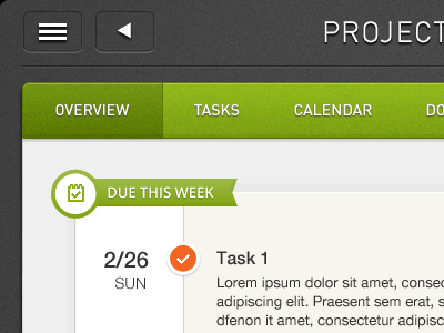
Project overview - iPad

Overview_v2

31 Responses (page 1 of 2)

  1. Pro Eric Hoffman Eric Hoffman

    good layout! love it

    likes

    about 1 year ago

  2. Pro Jason Wu Jason Wu

    A project overview UI I did a while back ago. Trying out a few things to give it a fresh look.

    about 1 year ago

  3. Pro Manu Gamero ☁ Manu Gamero ☁

    I like it overall, but maybe you must improve the white shadow on those top buttons!

    likes

    about 1 year ago

  4. Pro Jason Wu Jason Wu

    @Manu ☁ Thanks for the feedback. Sometimes I get carried away with the fun stuff and forgot about the small details.

    likes

    about 1 year ago

  5. Pro Oykun Oykun

    nice! Agree with @Eric Hoffman . ps, love the slim fonts and spacings... I would love to see whole thing.
    the green looks like Zendesk :)

    likes

    about 1 year ago

  6. Pro Jason Wu Jason Wu

    @♦ Oykun Yilmaz I can show you the whole thing but I have to kill you afterward.

    likes

    about 1 year ago

  7. Pro Underbelly (via Anthony Lagoon) Underbelly (via Anthony La...

    So clean, nice work Jason.

    likes

    about 1 year ago

  8. Pro Jason Wu Jason Wu

    about 1 year ago

  9. Pro Oykun Oykun

    @Jason Wu haha! I believe it worths :) , send it over to my email, and I send you my address, you can fly over to kill, or I can make harakiri!

    likes

    about 1 year ago

  10. Pro Jason Wu Jason Wu

    @♦ Oykun Yilmaz I have your address already. I will send @Eric Hoffman over tomorrow along with the design.

    likes

    about 1 year ago

  11. Pro Oykun Oykun

    @Jason Wu no no, not @Eric Hoffman . he is enough busy with killing plans to @Kerem Suer . Trust me, I perform harakiri ! ps, ok I stop messing your shot's design related comment area here :)

    likes

    about 1 year ago

  12. Pro Michael Shanks Michael Shanks

    Very clean, sharp and the textures are just sexy. Nice work

    likes

    about 1 year ago

  13. Pro Ryan Wheaton Ryan Wheaton

    Yup. Very clean Jason!

    likes

    about 1 year ago

  14. Pro Avinash Tripathi Avinash Tripathi

    really nice thing coming upp

    likes

    about 1 year ago

  15. Regina Casaleggio Regina Casaleggio

    Instant LOVE! Think you're just doing fine with the details ;)

    likes

    about 1 year ago

  16. Pro Simon van Acht Simon van Acht

    Really diggin' the menu and color scheme!

    likes

    about 1 year ago

  17. Pro Chris Sharp Chris Sharp

    Lovely, especially like how the icon in the ribbon circle is aligned with the corner of that inner module (if that makes sense?) - leads the eye to that heading.

    Not usually a huge fan of larger drop shadows but in this case it gives the top buttons some impact and clarity.

    likes

    about 1 year ago

  18. Pro Fabio Benedetti Fabio Benedetti

    @Jason Wu very nice interface design ++

    likes

    about 1 year ago

  19. Pro Muhammad El Melegy  Muhammad El Melegy 

    Love it!

    likes

    about 1 year ago

  20. Pro Joshua McCowen Joshua McCowen

    Minor polish here and there, but overall looking very good!

    likes

    about 1 year ago

  21. Corey Haggard Corey Haggard

    Ohh yeah, nice work dude!

    likes

    about 1 year ago

  22. Pro Eduardo Santos Eduardo Santos

    Top section of the green bar, looks blurred. You're using a double border. In wish the outer border is lighter than the background on top, but darker than the 1px border bellow, which causes the blurred effect. Remove the outer border and problem solved. :)

    Typography needs a bit of improvement, line-height is very small, I would increase it by just a little bit to make the lines breath a bit. Also add a bit of more space between the text and the "Task 1" title. ;) White-space is needed.

    The top left buttons, are blurred on the base of each box.

    The typeface on the Menu/Navigation if with a large weight could have better results. I'm not feeling the lightness of the typeface as a good aspect.

    I would remove the drop shadow on the "Project" word on top, it is very strong and with light typefaces don't work very well.

    Other than these critiques you have here a very nice layout, it just needs a bit of polishing. :) Keep it up!

    likes

    about 1 year ago

  23. Pro DX GRAPHIC DX GRAPHIC

    cooL!

    about 1 year ago

  24. Bri Bri

    sweet

    about 1 year ago

  25. Pro Vilen Vilen

    Very Clean!

    about 1 year ago

keyboard shortcuts: previous shot next shot L or F like