Mamma Qi Brand Exploration

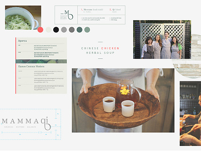


The goal was to create a mark that resonated with new mamma's. We built a pregnant belly into the descender loop of the lower case 'q' all while holding up, or lifting up, the lower case 'i' resembling a newborn.
Eames Century Modern & Apercu were used in the final brand style guide.
You can see more about it here
https://bruxtongroup.com/mamma-qi/
___
For all other updates or just to see what we are up to
https://bruxtongroup.com/


