Branding Lowell Panels

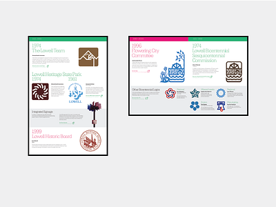


These are a few panels from the exhibit I designed and co-curated with Lowell National Historical Park covering the city's branding and design history. The overall idea is that we feature and cite as many original graphic artists as we could. We ended up with over 50 artists spanning 180 years.
The exhibit includes overarching color segments that represent certain periods in the city's history. @Lost Type Co-op 's Lehigh by @dan gneiding was chosen for use due to it being an appropriate period typeface (industrial revolution, etc) that wasn't too rigid and had lighter variants. We didn't want the type overpowering the artwork on the panels and it worked perfectly.
Info deemed "secondary" had a gray screen applied in order to separate it from the primary logos and not make things to visually busy.
One of my favorite details is the "extended content" icon changes depending on the shape of the panel where it is used.
We also have partnered with Lowell High School's Art Department and are selling merchandise to benefit their graphic arts classes.
The exhibit is open for spring and summer of 2018, and is located at the Patrick J. Mogan Cultural Center which is at 40 French Street in Lowell, MA. For a full preview of the exhibit check out this preview via AIGA Boston.


