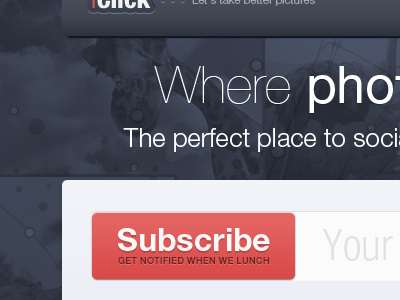
A proposal landing page for a client. If you want to stay updated Follow my tweets , (Not Forcing you!)