Interactive Diagram

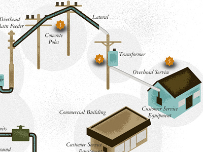
An interactive diagram showing how power is generated and distributed to customers. The user can control a slider at the bottom to reveal the journey power takes from start to finish. Orange "hotspots" reveal additional info via tooltips.


