Joshavatar

Toodles 22: Ligature concepts

Toodles_22

13 Responses

  1. Pro Joshavatar Joshua Bullock

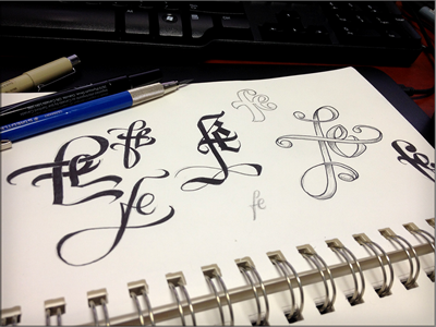
    Someone recently asked me about doing a ligature for the letters 'F' and 'E' which brought some interesting exploration. A lot of the 'Fs' look a bit too much like an uppercase 'L' so wouldn't hold up very well. Was still good for today's doodle.

    likes

    3 months ago

  2. Pro 851bd2fb35e64946ad785231708e0a75_6 Mandy McClausky

    Love that one smack-dab in the middle.

    likes

    3 months ago

  3. Pro Slater_small Nick Slater

    Look at those beautiful type designs! Makes me envious :D

    3 months ago

  4. 71908_1526927046916_1046876528_31340170_3911312_n Amy Stine

    Your work is mindblowing!

    3 months ago

  5. Pro Vicious-badge Greg Eckler

    These are all really good but the one to the most left is sick!

    3 months ago

  6. Pro Sharpavatar Curtis Sharp

    Very cool.

    3 months ago

  7. Pro Circular_logo kirk visola

    Gorgeous man. Simply gorgeous. my favorite is the itty bitty one on the bottom. Nice job.

    3 months ago

  8. Drr Hoss Halliburton

    you are a legend bro.

    3 months ago

  9. Pro Bulb o Isaac Grant *

    You are one hell of a calligrapher!

    3 months ago

  10. Pro My_profile_pic Erin Potter

    good looking stuff homie.

    3 months ago

  11. Pro Screen shot 2012-02-21 at 11 Adam Trageser

    +1 for right in the center! That one's "f" is out of control.

    3 months ago

  12. Pro 1505_04_r2_c1_logo I am Pablo

    Great style!...

    3 months ago

  13. Pro Cresk_avatar Gert van Duinen

    You da man Joshua... Maybe it needs some more love, but I really like the one top-left...

    9 days ago

keyboard shortcuts: previous shot next shot L or F like