Eh, I dunno. I feel like I've seen better from you. These don't feel very crisp and looks like a very cheap "default" type of layer style. I love your work, it's amazing, but this doesn't seem up to par.
The purplish and turquoise colors mix oddly, like if you brought the hues closer together it would compliment each other better and look like the glow is coming from the source. The glow is a completely different color than the source.
*edit* Just saw your shot with this type of style in context on the respective button and it looks a lot better. Seeing stuff out of context is lame, it just looks really odd here, but more correct in your other shot.
8 Responses
Pro
The Skins Factory
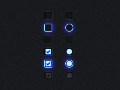
A look at some touchscreen elements created for the EXO UI 2.0 user interface we created.
© EXOPC. All Rights Reserved.
You can view our website at: http://www.theskinsfactory.com
3 months ago
Pro
Ryno van Niekerk
aweeeeeeeeeeesoooomeee!
3 months ago
Pro
Andrew Korytsev
This glowing is awesome! Love it!
3 months ago
Pro
Eric Guess
The glows and the color of 'em are great. It may just be how this is shown, but the "off" states are a bit too tough to see in comparison, imo.
3 months ago
Pro
Anthony Lagoon
I don't know if I've ever seen a glow that realistic. Kudos.
3 months ago
Pro
Keith Sereby
Oh, so very nice!!
3 months ago
Eh, I dunno. I feel like I've seen better from you. These don't feel very crisp and looks like a very cheap "default" type of layer style. I love your work, it's amazing, but this doesn't seem up to par.
The purplish and turquoise colors mix oddly, like if you brought the hues closer together it would compliment each other better and look like the glow is coming from the source. The glow is a completely different color than the source.
*edit* Just saw your shot with this type of style in context on the respective button and it looks a lot better. Seeing stuff out of context is lame, it just looks really odd here, but more correct in your other shot.
3 months ago
Pro
Mani
awesome.
3 months ago