Git Logo Concept

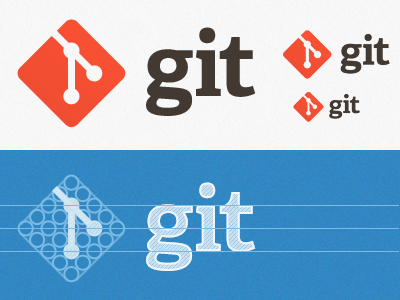
I'm working on the redesign of http://git-scm.com and took a stab at coming up with a new Git logo. If you're familiar with Git, you'll recognize that the concept is based on branching. I started with making grids out of coins until I decided that 5x5 worked the best.
UPDATE: My GitHub colleague Matt Graham has put together a great Git logo pack (EPS, PDF, PNG) based on this design. Download it here.


