Messages Icon

Messages-icon

25 Responses

  1. Wolfgang Bartelme Wolfgang Bartelme

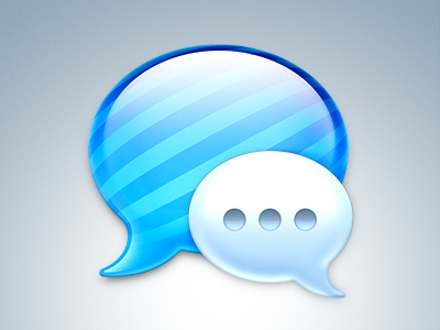
    My take on the Messages icon. Same concept, same shapes… just a tad more polished. What do you think?

    likes

    over 1 year ago

  2. Atanas Mahony Atanas Mahony

    There is an app for that: INSTALIKE ! :)

    over 1 year ago

  3. Umar Irshad Umar Irshad

    Way better, hated the original one.

    over 1 year ago

  4. Ramotion Ramotion

    @Wolfgang Bartelme Looks good :)

    over 1 year ago

  5. Marc Edwards ✎ Bjango Marc Edwards ✎ Bjango

    I really love this. Not sure about anyone else, but I find the ... of the original (and this version) slightly distracting. I keep thinking someone is typing a message, even when the app is idle. Probably just me though.

    Anyway, I really dig the wider lighting effects on the sides.

    likes

    over 1 year ago

  6. Oliver Twardowski Oliver Twardowski

    The blue bubble is awesome, Wolfgang. Still have my problems with the small one. It just looks as if somebody is typing right now … The look and feel is way better in your icon, though. Really Great work!

    Wie immer sehr sehr gute Arbeit! :)

    likes

    over 1 year ago

  7. Max Fellmuth Max Fellmuth

    Maybe it's just me but the small bubble looks a bit too blurred in the lower half

    likes

    over 1 year ago

  8. Olli Wiegner Olli Wiegner

    Sweet jesus, this is awesome!
    You should maybe darken the stroke on the "...".

    over 1 year ago

  9. Matt Zanchelli Matt Zanchelli

    I still don't like the stripes, but I understand you were sticking to their idea, just fixing it up a bit. It does look so much better.

    likes

    over 1 year ago

  10. Vincent Gosselin Vincent Gosselin

    @Bjango ✎ Marc Edwardsys Not just you :) I get the same feeling about someone always typing a message. I removed the icon from my dock because it was distracting...

    over 1 year ago

  11. Gianluca Divisi Gianluca Divisi

    @Wolfgang Bartelme much better than original :)
    no chance for a download link?

    likes

    over 1 year ago

  12. Steffen Nørgaard Andersen Steffen Nørgaard Andersen

    I would maybe make the dots in the white bubble slightly darker, however GREAT work @Wolfgang Bartelme !

    over 1 year ago

  13. Chris Wallace! Chris Wallace!

    @Wolfgang Bartelme I'd love to post the PSD on 365psd if you're interested. Feel free to submit it here:

    365psd submission form

    over 1 year ago

  14. Kevin Harris Kevin Harris

    That is absolutely stunning! Awesome job.

    over 1 year ago

  15. Matt Graham Matt Graham

    Beautiful. Would love to sport this guy on the dock. :)

    over 1 year ago

  16. Devon Govett Devon Govett

    Very nice! Now I just want an ICNS file. :D

    over 1 year ago

  17. Waseem Arshad Waseem Arshad

    awesome

    over 1 year ago

  18. Mainly for practice, but also because I didn't like the "..." on the original shot.

    I just can't get the 3d feel right - it's so great on Wolfgang's shot.

    Here's the .psd

    over 1 year ago

  19. over 1 year ago

  20. Jumping on the bandwagon, but with a bit of the old iChat icon in there too.

    over 1 year ago

  21. My first day on Photoshop, I really liked Bartelme's version, so I thought to remake it for self-training, this is the result.

    over 1 year ago

  22. Rogie Rogie

    @Wolfgang Bartelme love it. Looks great. I really like how the magnifying effect of the glassy substance alters the width of the diagonal lines.

    over 1 year ago

  23. Dietmar Kerschner Dietmar Kerschner

    Nice work on this wone Wolfgang, Looks way more polished.

    over 1 year ago

  24. Wolfgang Bartelme Wolfgang Bartelme

    Btw i just released the icon. Grab it while it's hot :) http://www.bartelme.at/journal/archive/messages_icon

    over 1 year ago

  25. over 1 year ago

keyboard shortcuts: previous shot next shot L or F like