The only thing that feels awkward is the little line coming off the "u". I don't know any suggestions on how to fix that, but maybe just fiddle around a bit more there.
This is so beautiful, I really like it. Yea for what Owen said, you could always thin out that final swash a little, just to make sure it's obviously not a letter. I absolutely love the letter interactions everywhere, looks great.
18 Responses
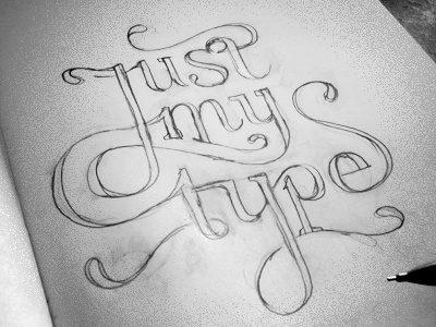
Working on a printed portfolio/résumé. This early sketch would be the title of the typography section.
over 1 year ago
This is beautiful Floris, nice work!
over 1 year ago
Beautiful, Floris. I like how it all fits together.
over 1 year ago
Great!
over 1 year ago
yes sir! great sketch.
over 1 year ago
oh SNAP! awesome flow :)
over 1 year ago
Thanks for the kind words people :)
over 1 year ago
Phenomenal! Nice play on words and beautiful type! :)
over 1 year ago
You got skills, Floris!
over 1 year ago
I love it!
The only thing that feels awkward is the little line coming off the "u". I don't know any suggestions on how to fix that, but maybe just fiddle around a bit more there.
over 1 year ago
Dit is bizar, Floris. Geweldig werk!
over 1 year ago
Beautiful sketch!
To me "u" is ok.
over 1 year ago
Looks great - REALLY great - only problem for me is the swoosh from the final 'e' reads as 'S' so Just My Types.
over 1 year ago
This is so beautiful, I really like it. Yea for what Owen said, you could always thin out that final swash a little, just to make sure it's obviously not a letter. I absolutely love the letter interactions everywhere, looks great.
over 1 year ago
Mmmm yes!
about 1 year ago
i've been missing a lot of good work from you. not sure why i wasn't following you earlier.
about 1 year ago
fannnccyyy!!! i like!
about 1 year ago
I absolutely love this.
12 months ago