Coursefinder mobile - UI planning

Shot_1281341534

7 Responses

  1. Paul Stanton Paul Stanton

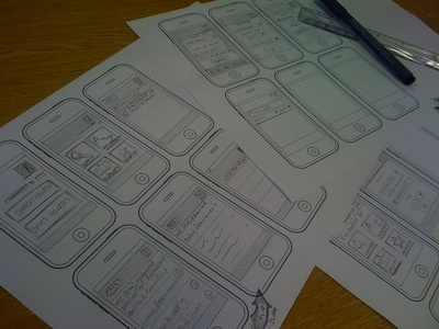
    Playing with ideas for a mobile UI for the University of Leeds' Coursefinder, trying not to make it *too* iPhone like as it should be perceivable on all mobile platforms.

    almost 3 years ago

  2. Pro Andy Birchwood Andy Birchwood

    It's a peculiar problem isn't it? I wonder if android users get annoyed by iphone graphics in their apps.

    almost 3 years ago

  3. Paul Stanton Paul Stanton

    I'm hoping the benefits of the Apple-like consistency will out-weigh the disadvantage of having an Apple-like UI on a non-Apple platform

    almost 3 years ago

  4. Working my sketches up into high-fidelity storyboards, which demonstrate the various screen layouts based on user interaction. It's still looking very iPhone-like, especially with that top bar so I might end up tweaking that a little as not to alienate $insertOtherMobileOS users

    • 5
    • 3
    • 4,250

    almost 3 years ago

  5. Andrea Austoni Andrea Austoni

    Good of you Paul to try and define an independent interface.
    Android has no consistency of its own and it doesn't even enforce it among its developers. They even approve apps with iPhone-style icons (rounded corners). What else do they expect?
    On the other hand designers should stop being "inspired" by Apple. Pixels are more flexible than that.

    almost 3 years ago

  6. Jessie White Jessie White

    I like how simple your wireframe templates are. What did you use to set that up? Omnigraffle? Your own?

    over 2 years ago

  7. Paul Stanton Paul Stanton

    over 2 years ago

keyboard shortcuts: previous shot next shot L or F like