Find designers
Designer search
Quickly find your next designer
Post a job
The #1 job board for design talent
Inspiration
Courses
UX Diploma
Learn UX design from scratch in 6 months
UI Certificate
12-week UI skill building for designers
Live interactive workshops
with design professionals
Jobs
Go Pro
Log in
Dribbble: the community for graphic design
Log in
Sign up
Edit Delete Options
Eric Guess
Available for work
Follow
Following
Like
Get in touch
#FBFBFA
#BC5E3D
#F8975C
#632F21
#AEAAA8
#2B1913
#F2DB9D
#EFBA7C
Download color palette
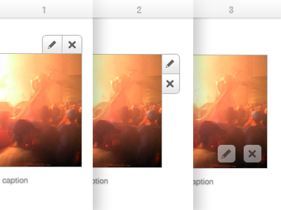
1, 2 or 3..?
controls
delete
edit
options
photo
ui
View all tags
Posted on Feb 17, 2012
2,055
1
12
9
View feedback
Eric Guess
Get in touch
More by Eric Guess
View profile
Previous
Next
Loading…
Loading…
Loading…