Find designers
Designer search
Quickly find your next designer
Post a job
The #1 job board for design talent
Inspiration
Courses
UX Diploma
Learn UX design from scratch in 6 months
UI Certificate
12-week UI skill building for designers
Live interactive workshops
with design professionals
Jobs
Go Pro
Log in
Dribbble: the community for graphic design
Advance your career with a Professional Diploma in UX Design
Learn more
Log in
Sign up
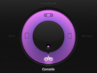
Dark dial button
Pieter van Est
Available for work
Follow
Following
Like
Get in touch
#191919
#8D4FAD
#AA63D3
#553467
#6F3D8D
#E4A0E9
Download color palette
Just trying a dark version of the awesome dial button from
Supersteil
Rebound of
Dial Button
By
William Duijzer
button
dark
dial
gaming
interface
purple
ui
View all tags
Posted on Feb 17, 2012
3,678
4
61
2
View feedback
Pieter van Est
Freelance Brand & Digital Designer
Get in touch
More by Pieter van Est
View profile
Previous
Next
Loading…
Loading…
Loading…